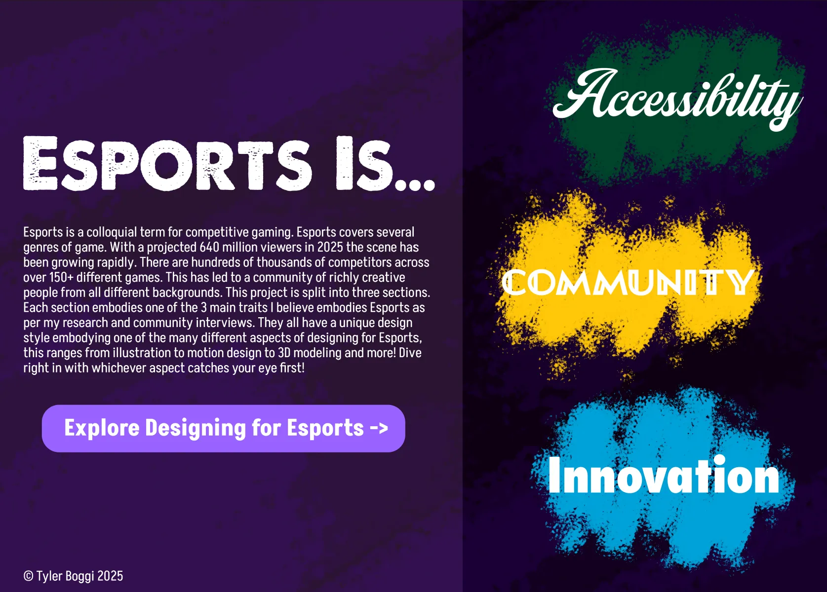
Esports Visualized
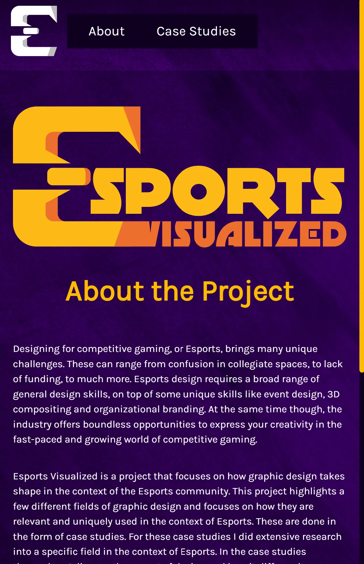
Esports Visualized is a project that focuses on how graphic design takes shape in the context of the Esports community. This project highlights a few different fields of graphic design and focuses on how they are relevant and uniquely used in the context of Esports. These are done in the form of case studies. For these case studies I did extensive research into these disciplines when being used in the Esports scene. In the case studies themselves I discuss the aspect of design and how it differs when applied to Esports but take it one step further and apply it myself to give a visual demonstration of what is discussed in the case study. These were all real and applied designs made and used for a purpose in order to give an accurate depiction of what it is like to design for Esports and the unique challenges that come with it.
Preface
This project was made as a Senior Thesis project for the 2026 SUNY New Paltz Design Show, if you would like to learn more about that check out the page on the work I did for that event! Additionally, all of my final designs and work can be found on the Esports Visualized website. On this site is all of the individual fully written case studies with all of the real work that I produced through this thesis project.
Before Thesis
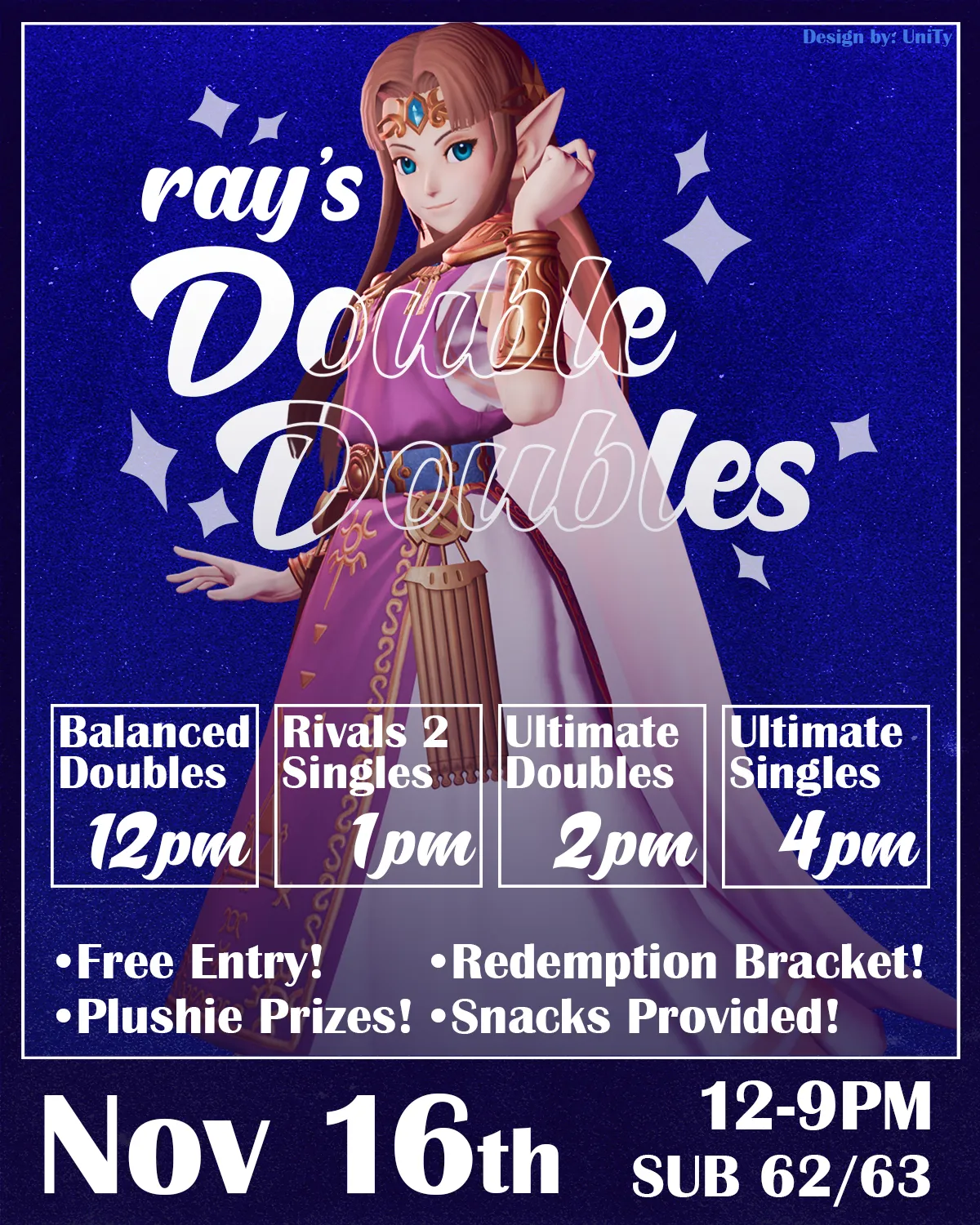
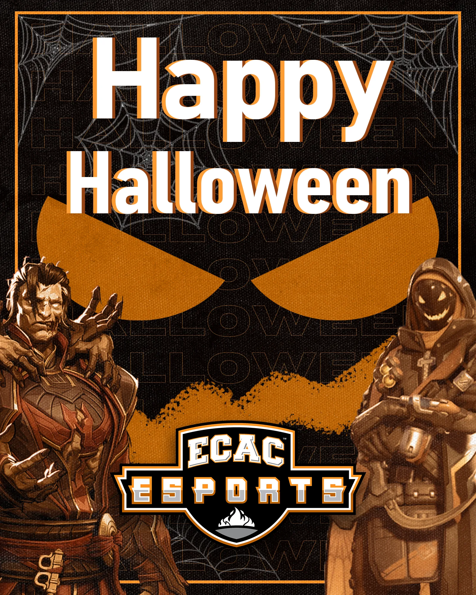
Even before beginning on my thesis, I had always been very active in the various Esports scenes at New Paltz. I was both an active competitor in several titles as well as a graphic designer in the space. In specific I mainly worked as the lead graphic designer for New Paltz Smash Club and as an intern designer for SUNY/ECAC Esports.
Having been designing for Esports for a while now this project was about taking all of that knowledge I gained in the industry and distilling it into a more digestible and visually interesting format.
Thesis 1: Research
For my initial research process I looked at other organizations and popular media in Esports and fully disected what techniques were being used and why. For example, I had plans to do branding similar to and Esports Team or "Org". In order to accomplish this I looked at popular Orgs that fit my vision for the project. What I found out was there was heavy use of bright, monochromatic color schemes and minimalist logos, often with heavy symbolism, that could be fit easily into any in-game or outof-game branding. While plans did shift over t ime into a more distinct visual style, most of what I learned I still carried over into my new vision as the project went on.


For additional research I did more focused explorations on a few different organizations that focus on one individual design field that I was interested in incorperating.

PechaKucha
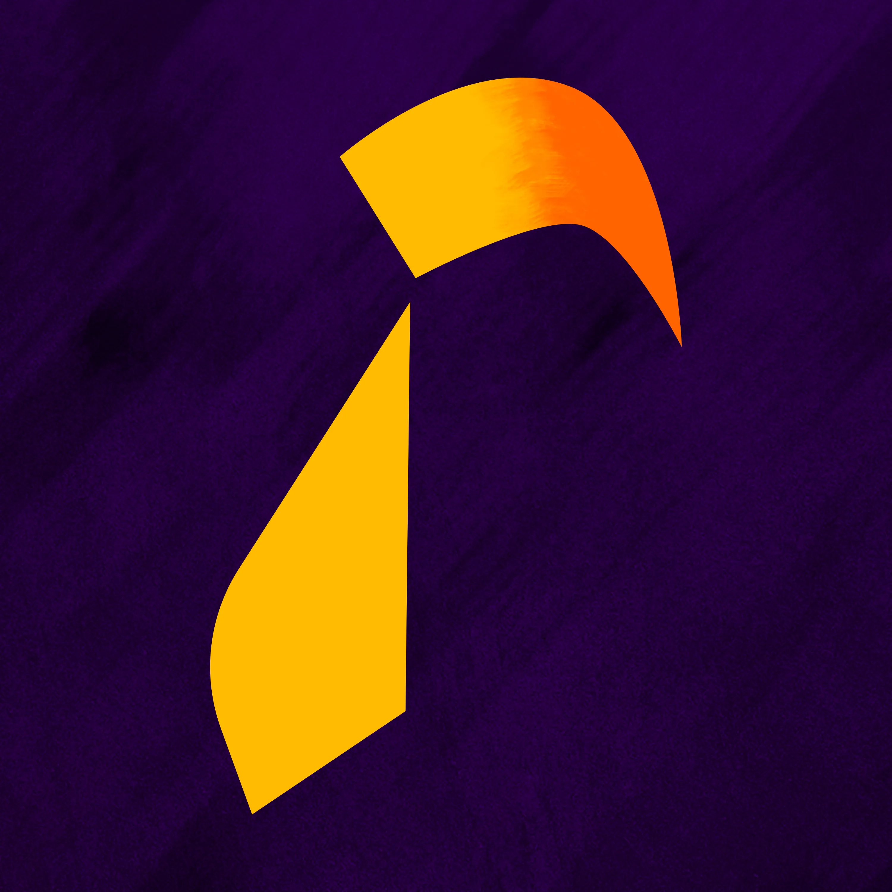
My PechaKucha project presentation was a part of our process where we pitched our thesis concept to a group of viewers. This was a big turning point for my project. This is where I was able to solidify the idea that I wanted to make three distinct case studies in order to showcase what Esports design has to offer. It was also a big turning point in getting me more comfortable openly and confidently discussing my thesis. In terms of visual style I developed the use of purple as a good background color and was the first use of the sketchy & detailed background texture.
Thesis 2: Process
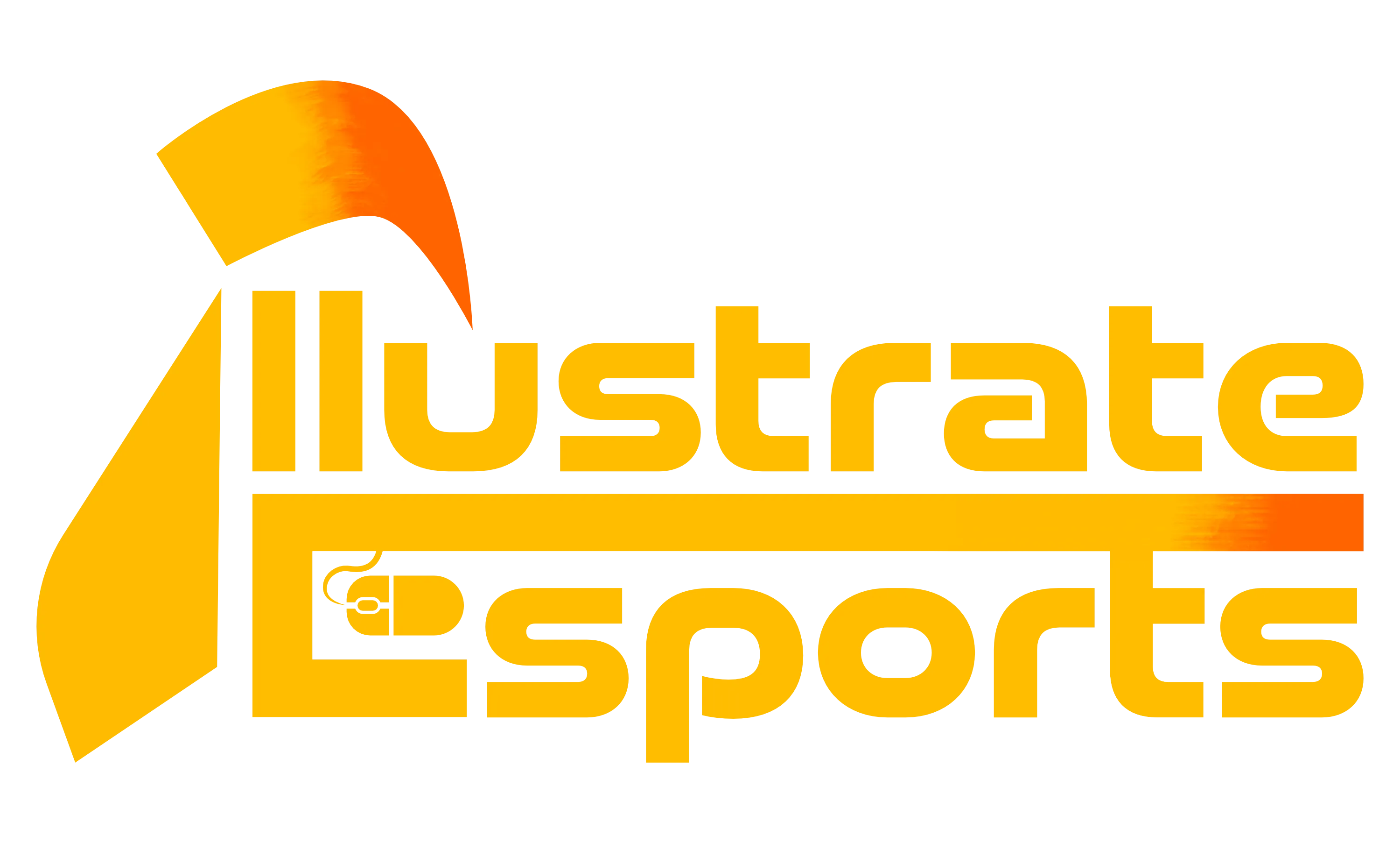
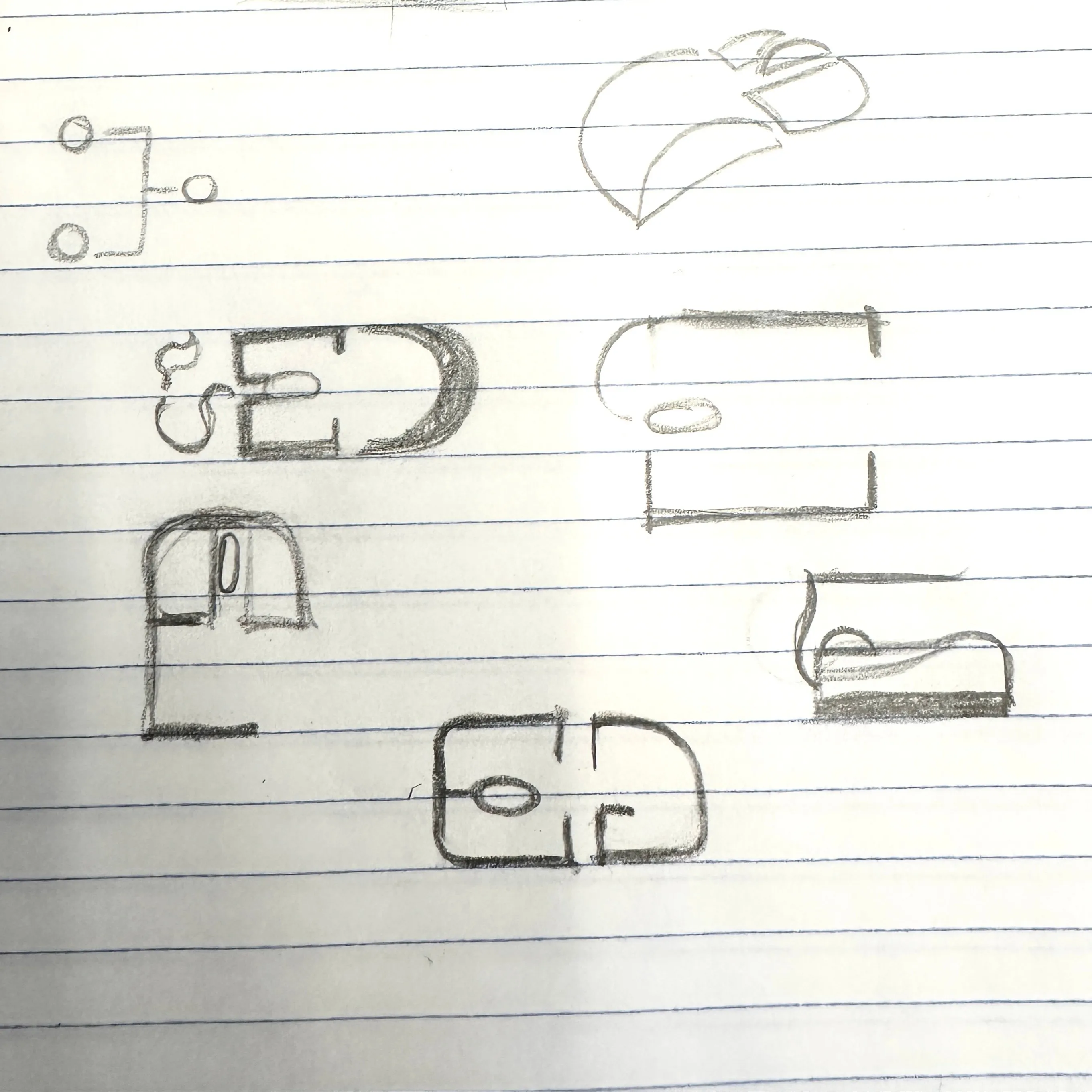
The first thing on my priority list going into thesis two was to establish a branding for the project that I could base subsequent material and, most importantly, the website around. You can see here my initial sketches for the project branding. My initial title for the project was "Illustrate Esports" and I was going for a more "Esports Organization" look. You can see the establishment here of yellow being the main color for the project, this is something I did to stand out from other Esports organizations as not many used yellow, which made it more apparent that this was a creatively-focused Esports project.
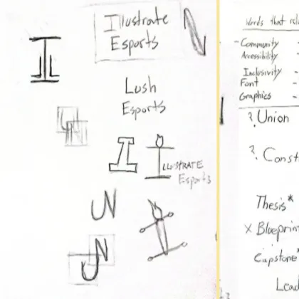
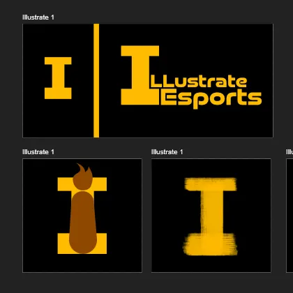
From here I developed out my first full concept for Illustrate Esports! I aimed to mimic traditional Esports Org branding in this logo while also managing to make it work for people that are coming into this for the first time. Turns out though that this initial branding, while a good start, was failing to communicate as "Esports" to people outside the scene while also not being too stand out to existing fans of Esports to necessarily matter. So it was back to brainstorming...

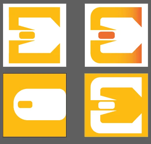
I took what I recieved positive feedback on. That being the colors, sketchy textures and letter symbolism on the letters. I instead decided to focus on the "E" in Esports as it is the central word related to my project. I also added mouse symbolism in the negative space which relates more to Esports than the brush symbolism from before. I essentially focused on adapting the original concept to be more iconic and recognizable.
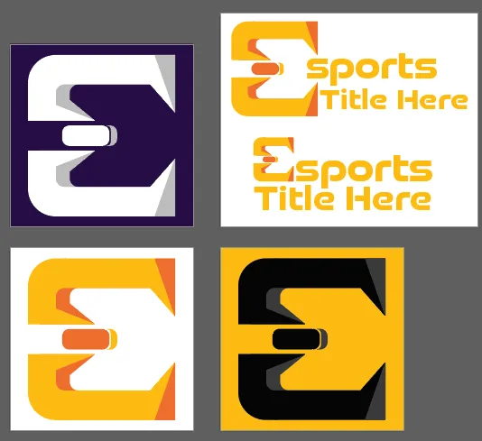

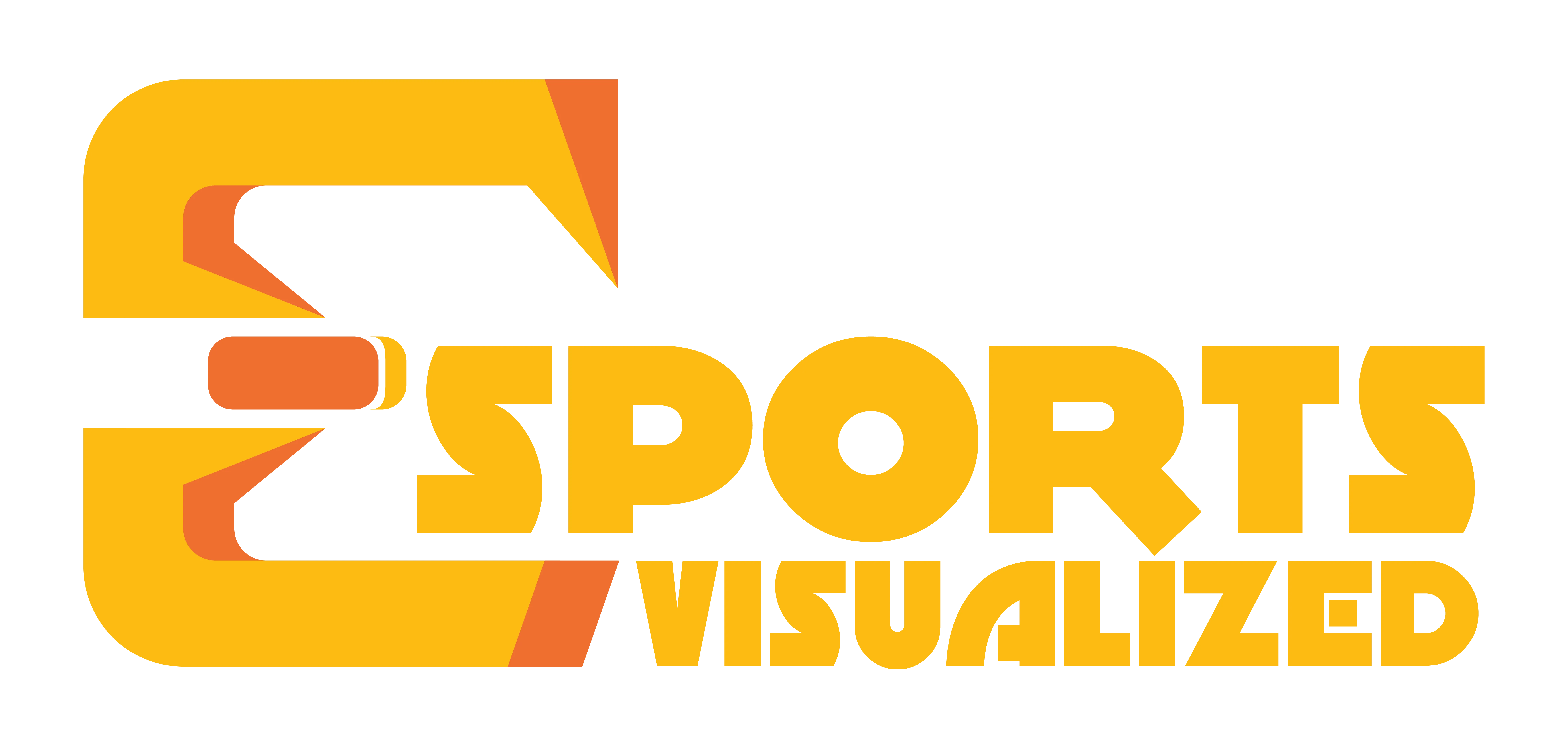

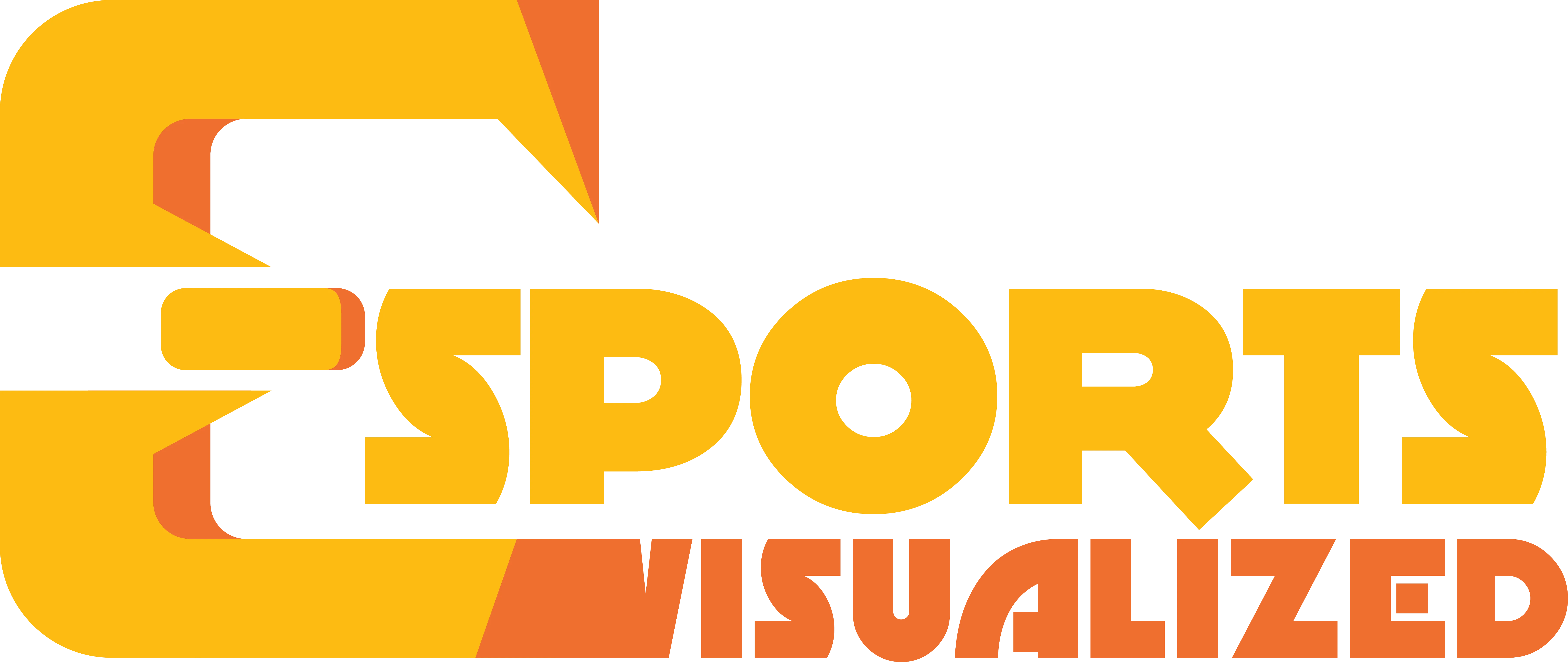
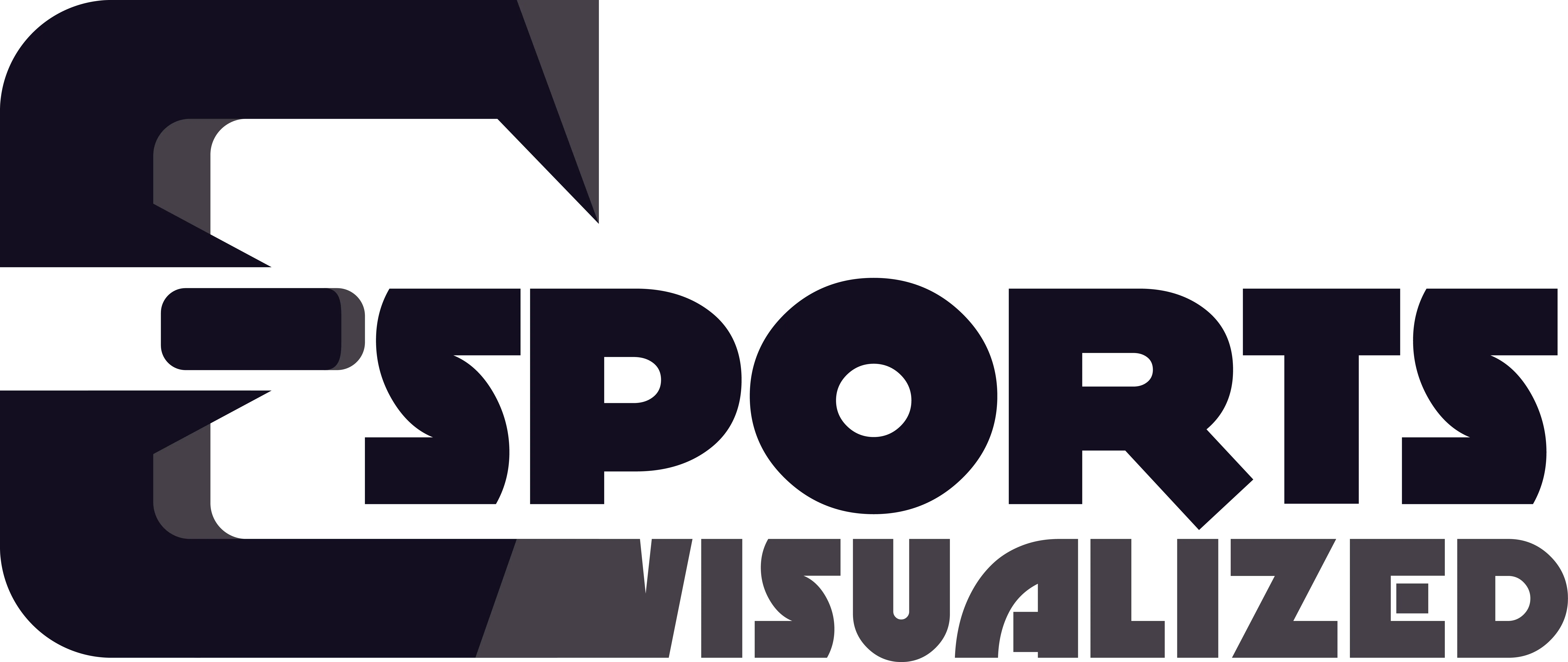
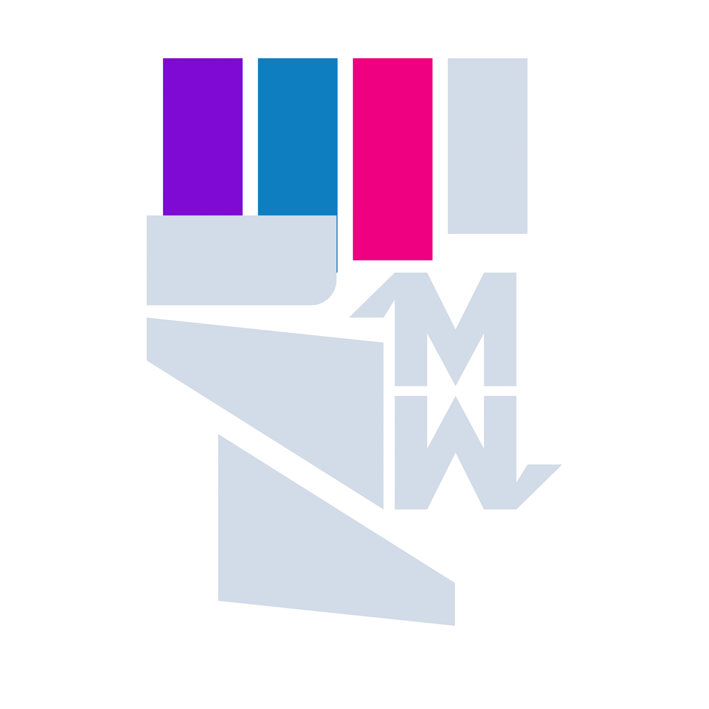
Final Outcomes
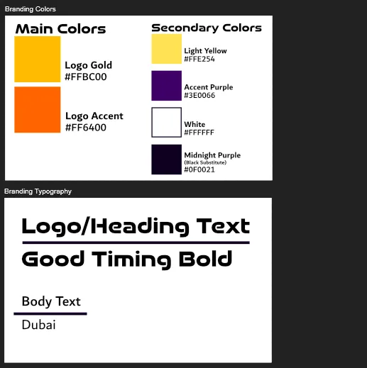
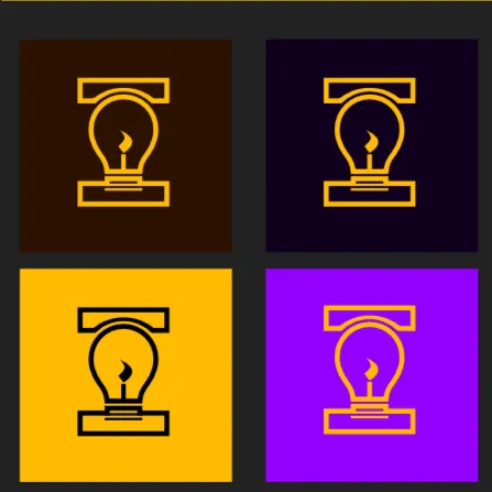
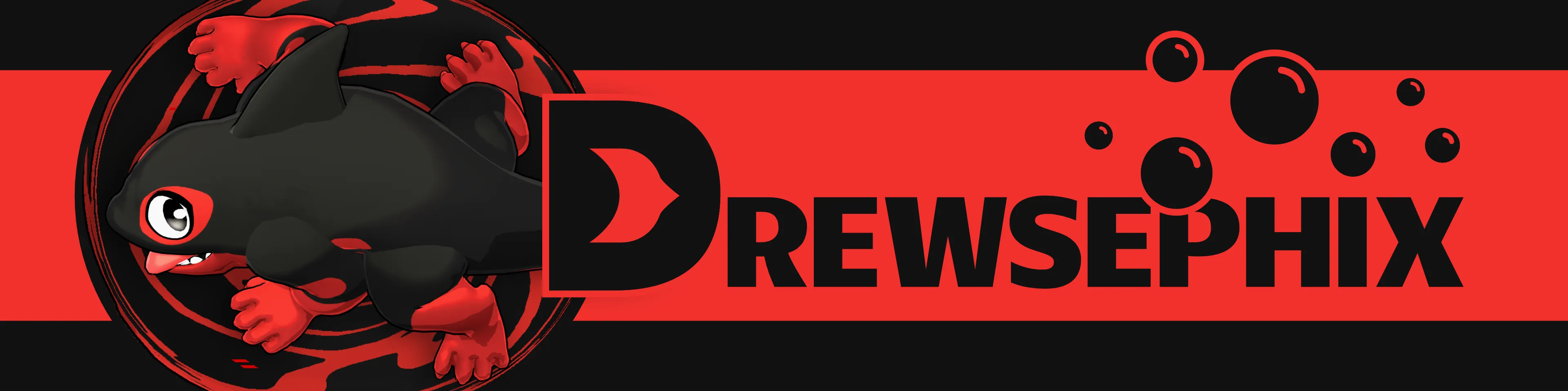
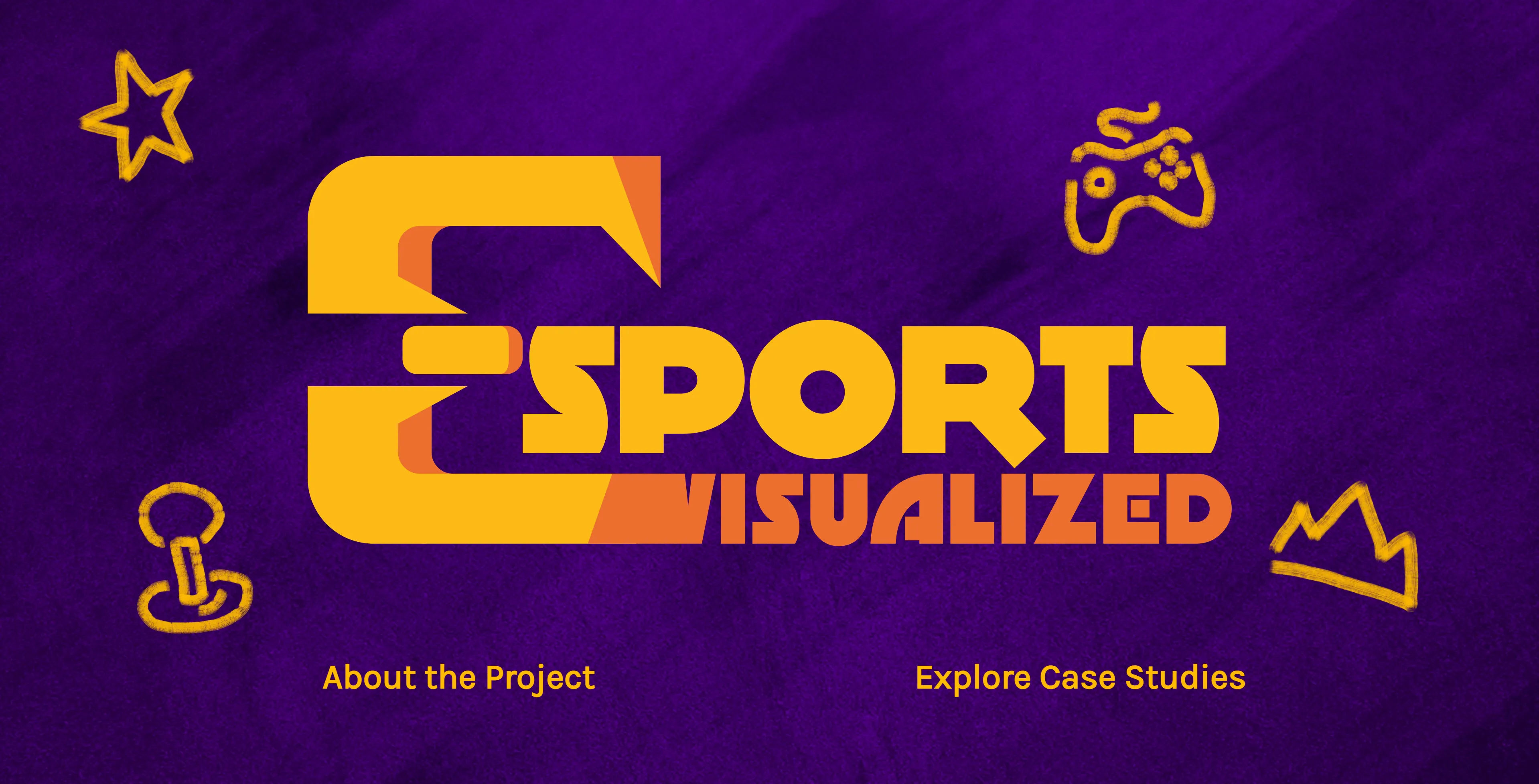
And this what I ended with for my Final Branding! Included in this as well is black and white variations on the logo for multiple purposes as well as two variations on the background texture for widespread use in the project website and advertisement. It strikes a good balance of following traditional Esports branding styles while also being recognizable and iconic to people just seeing what Esports is for the first time.


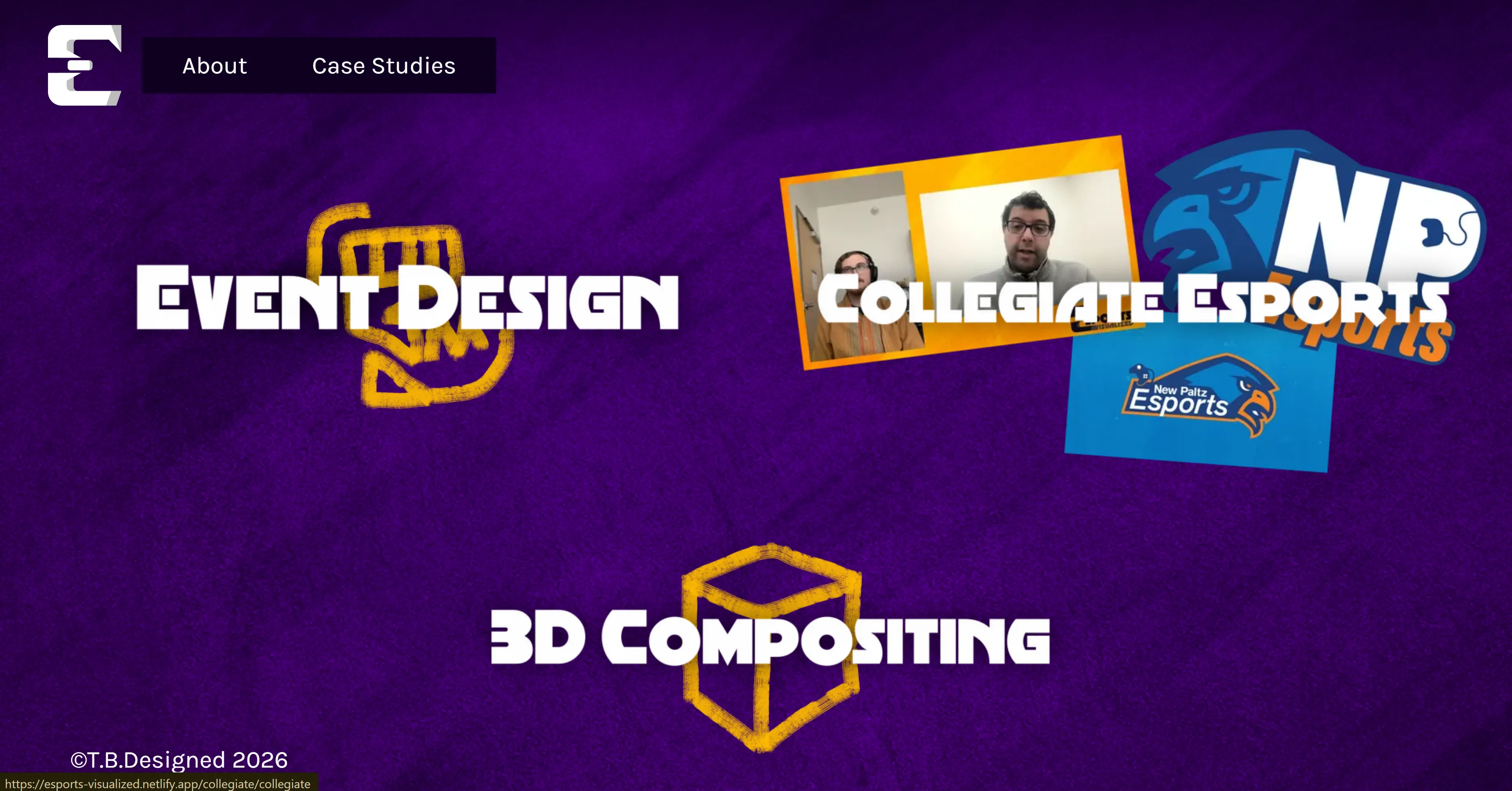
Case Studies
As mentioned earlier for the main part of this project I covered three case studies on how Esports design looks in three different fields. The full breakdowns were all documented on the Esports Visualized website so I would heavily reccomend seeing the work there as well.
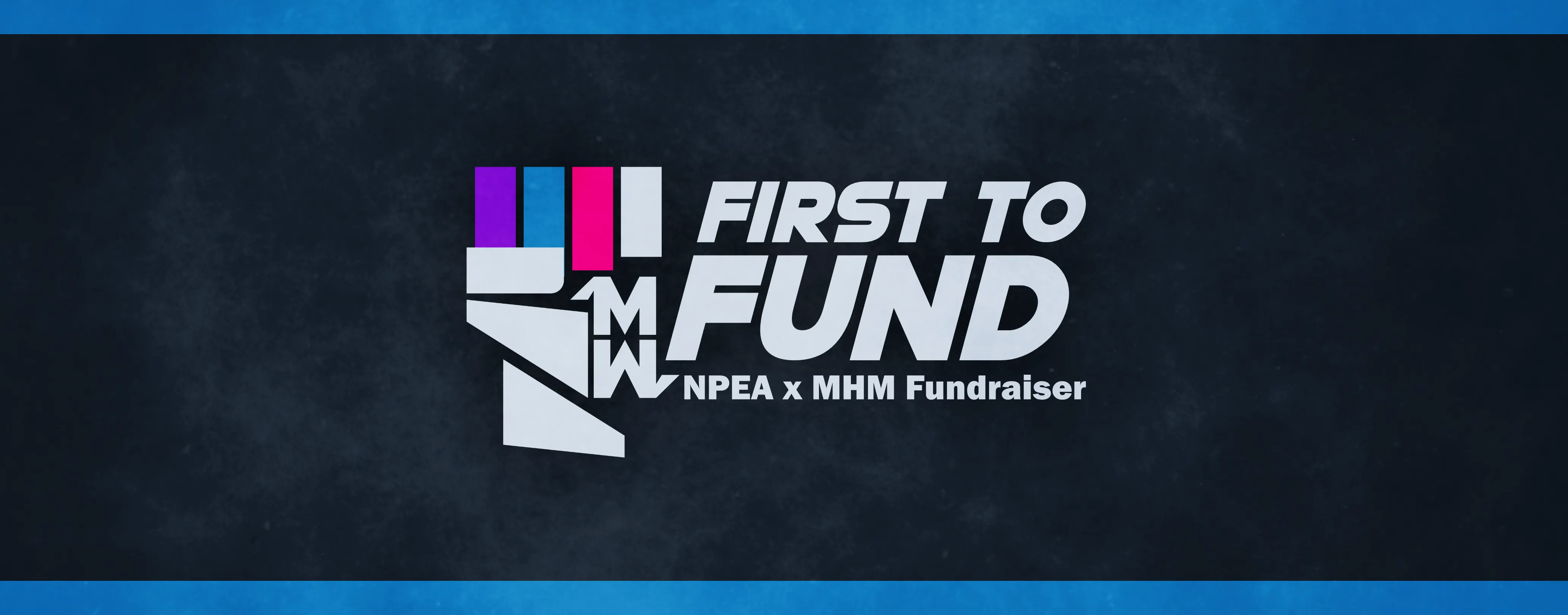
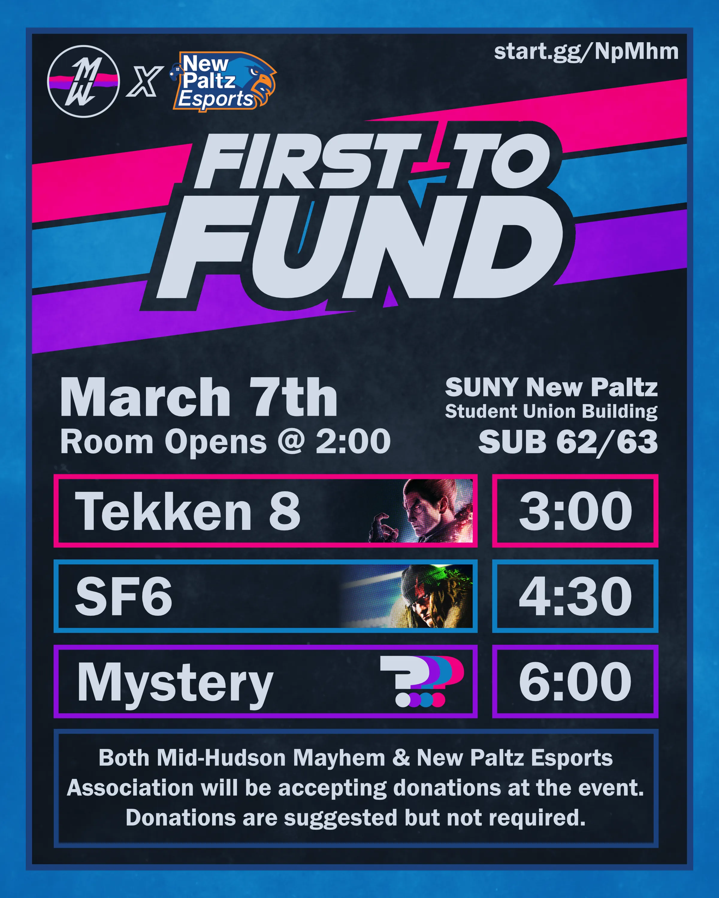
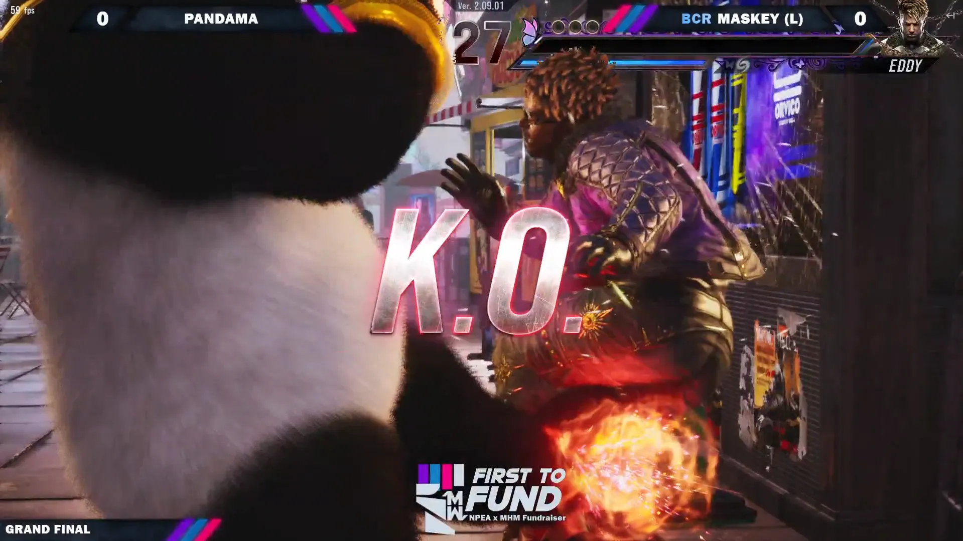
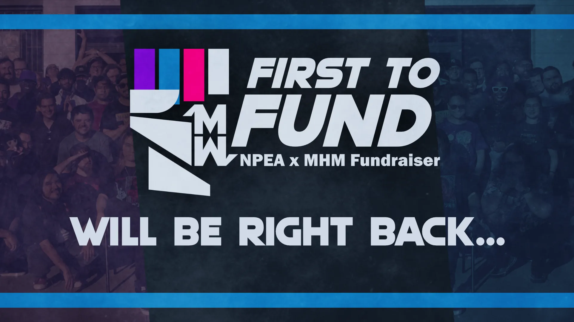
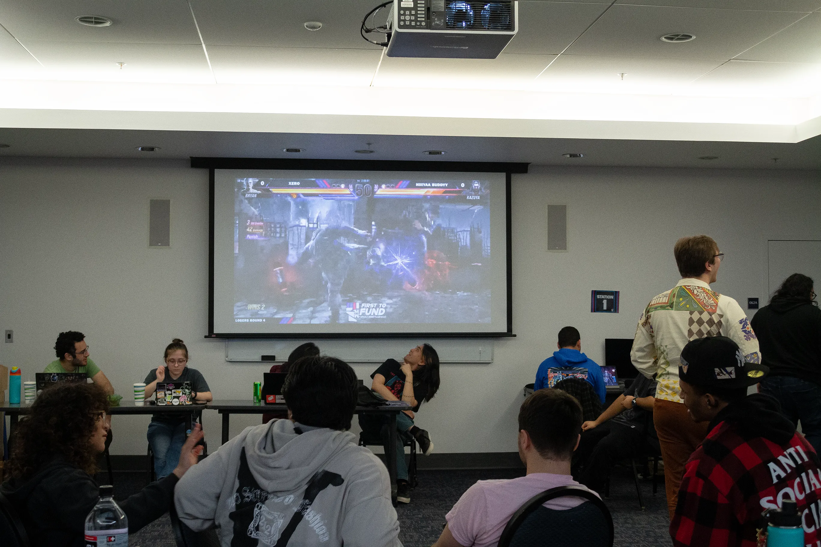
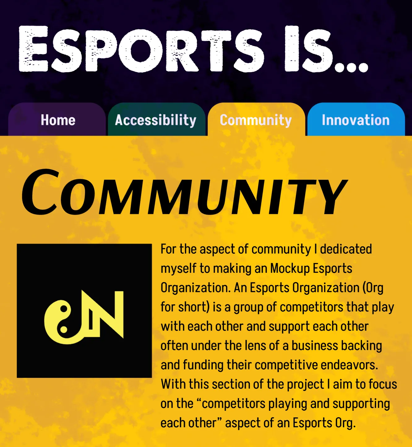
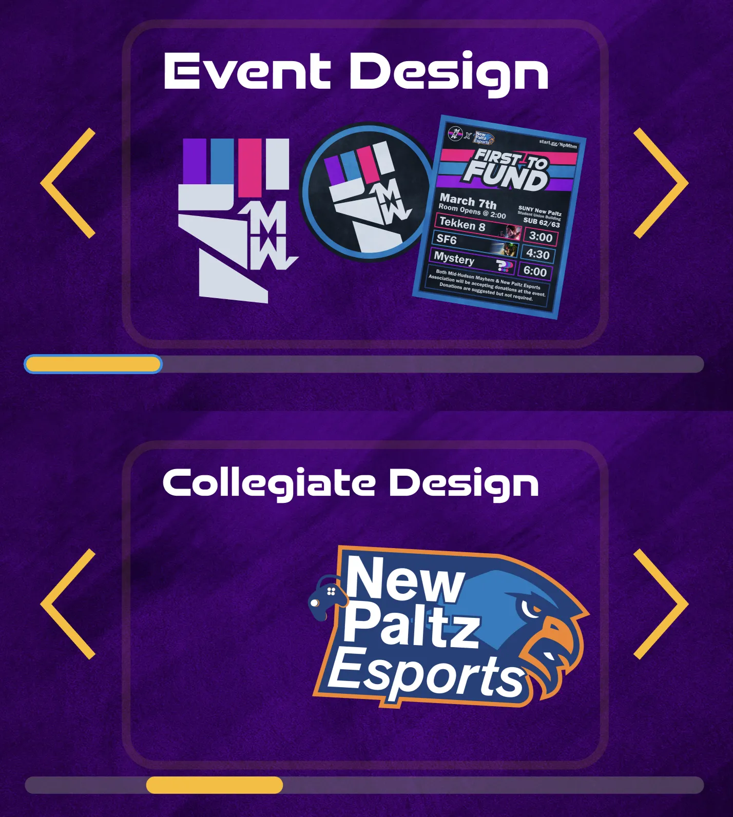
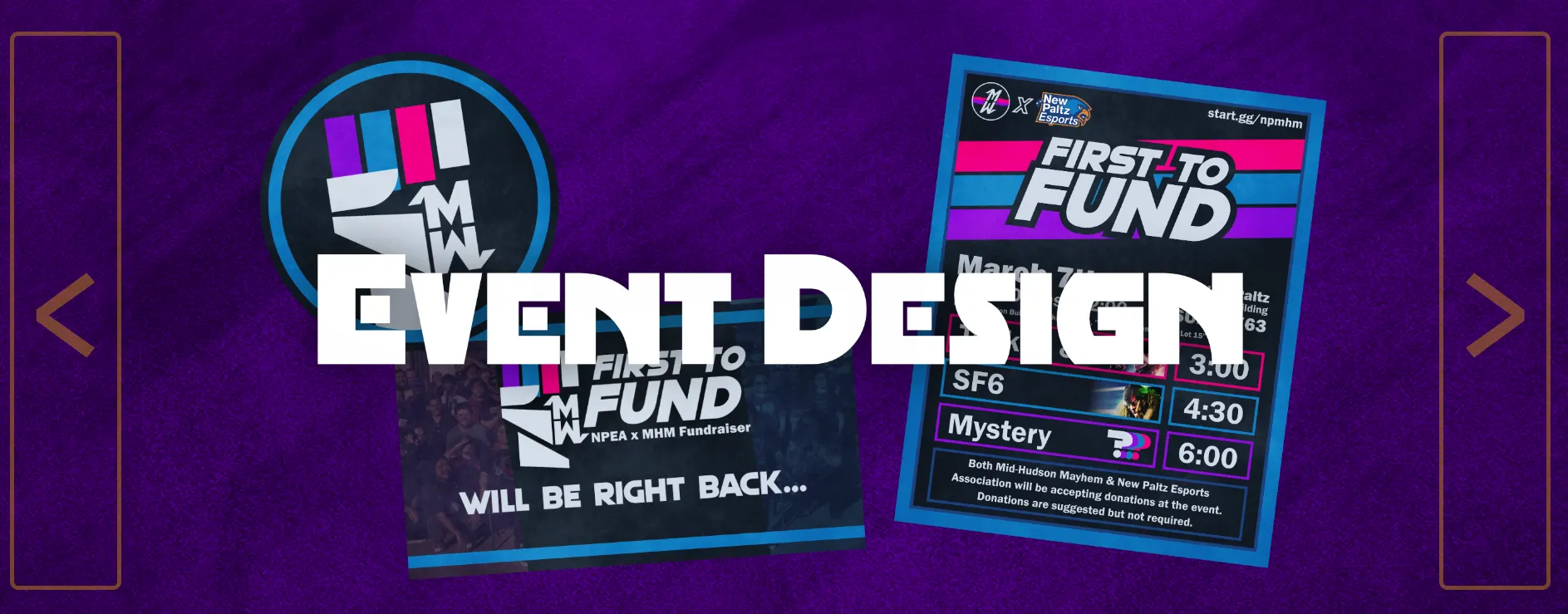
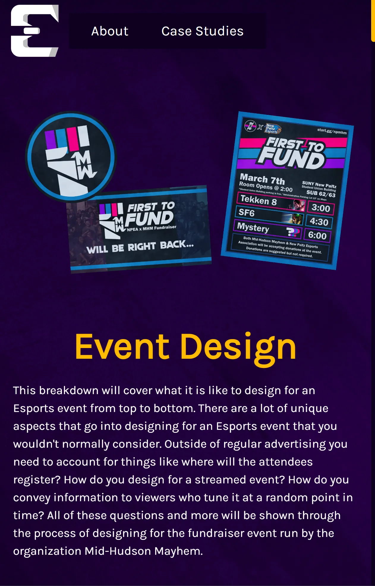
Case Study 1: Event Design
For this case study I worked with Mid-Hudson Mayhem to host a fighting game tournament. I researched the organization as well as fist-related symbolism as I knew thats what I wanted the event to look like. For my final outcomes I made branding, advertising, streaming material, and more! The event was hosted to 42 attendees total and a few more that just showed up to check out the event. It also had about 80 total live viewers on the Twitch stream.

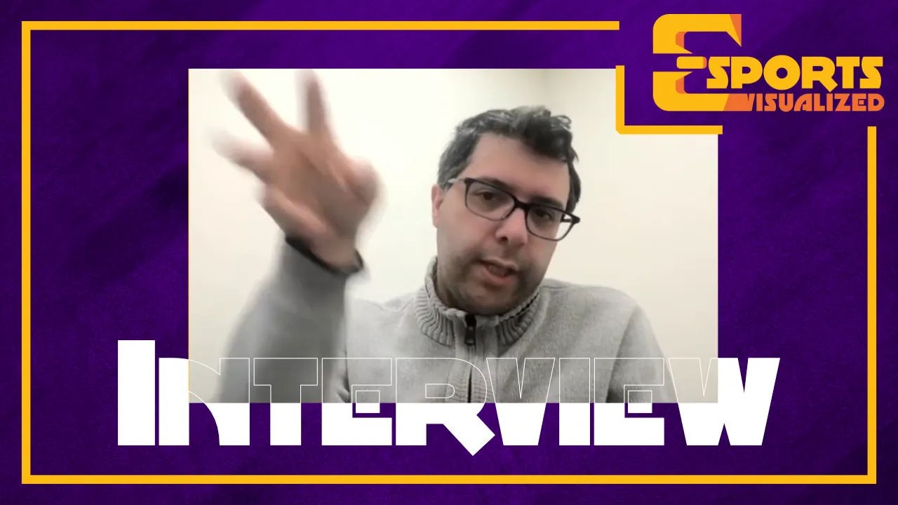
Case Study 2: Collegiate Esports
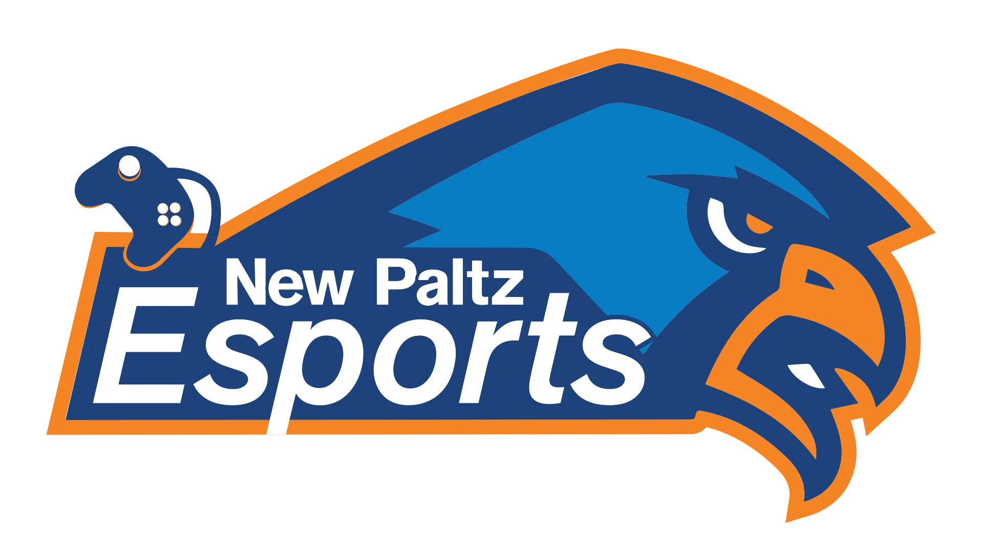
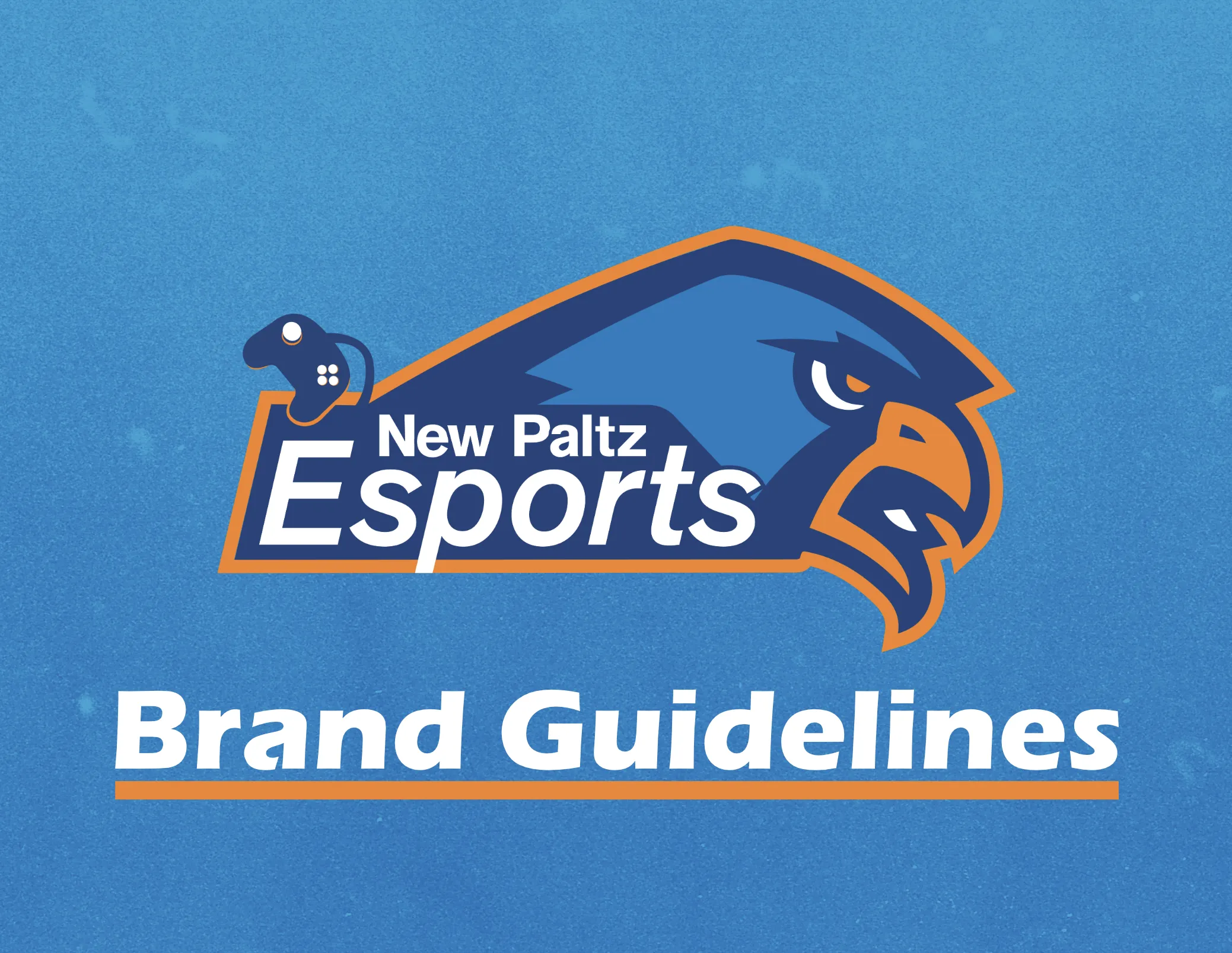
For this Collegiate Design case study I held an interview with the director of Esports at UAlbany in order to see how their program handles design and referenced their schools work. From there I made iterations on a new logo for New Paltz Esports in order to apply what I learned. For my final outcome I renewed New Paltz Esports branding and created brand guidelines for them!
Here is the in-progress iterations for the New Paltz Esports Logo.
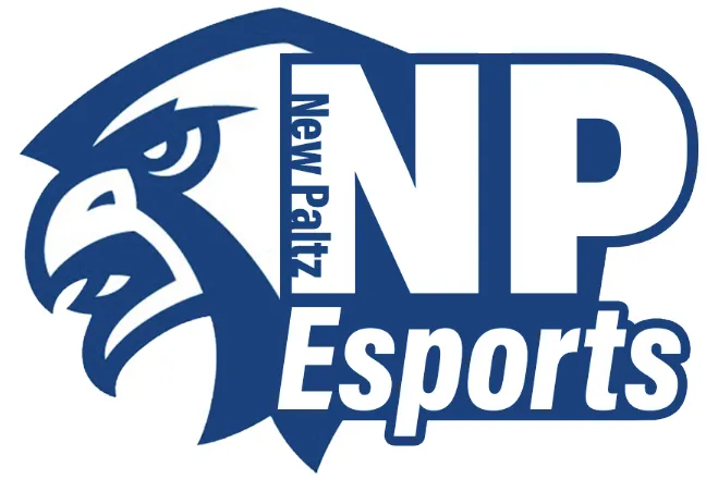
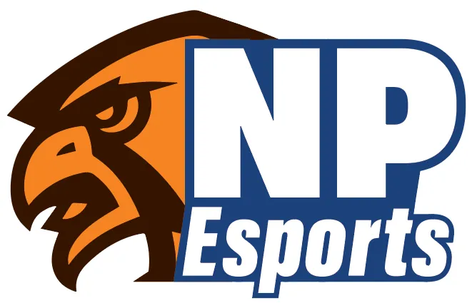
And here are the final outcomes! If you want to see the full brand guidelines, visit the projects website.
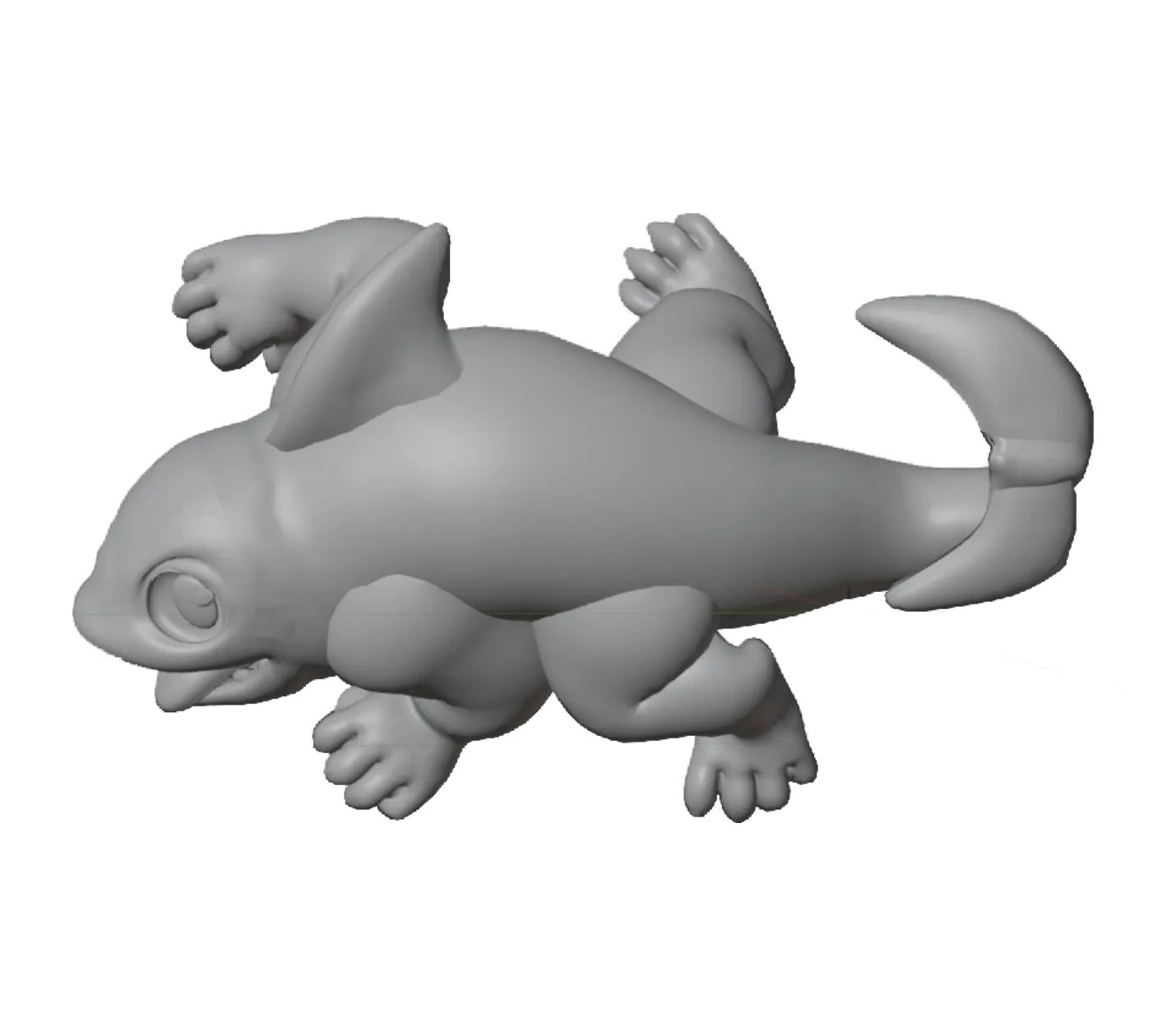
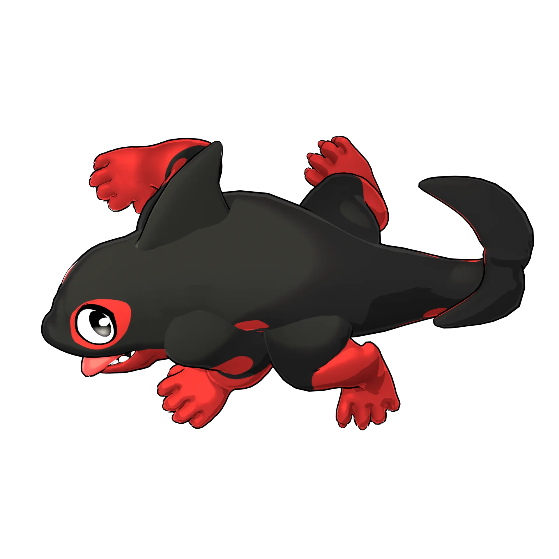
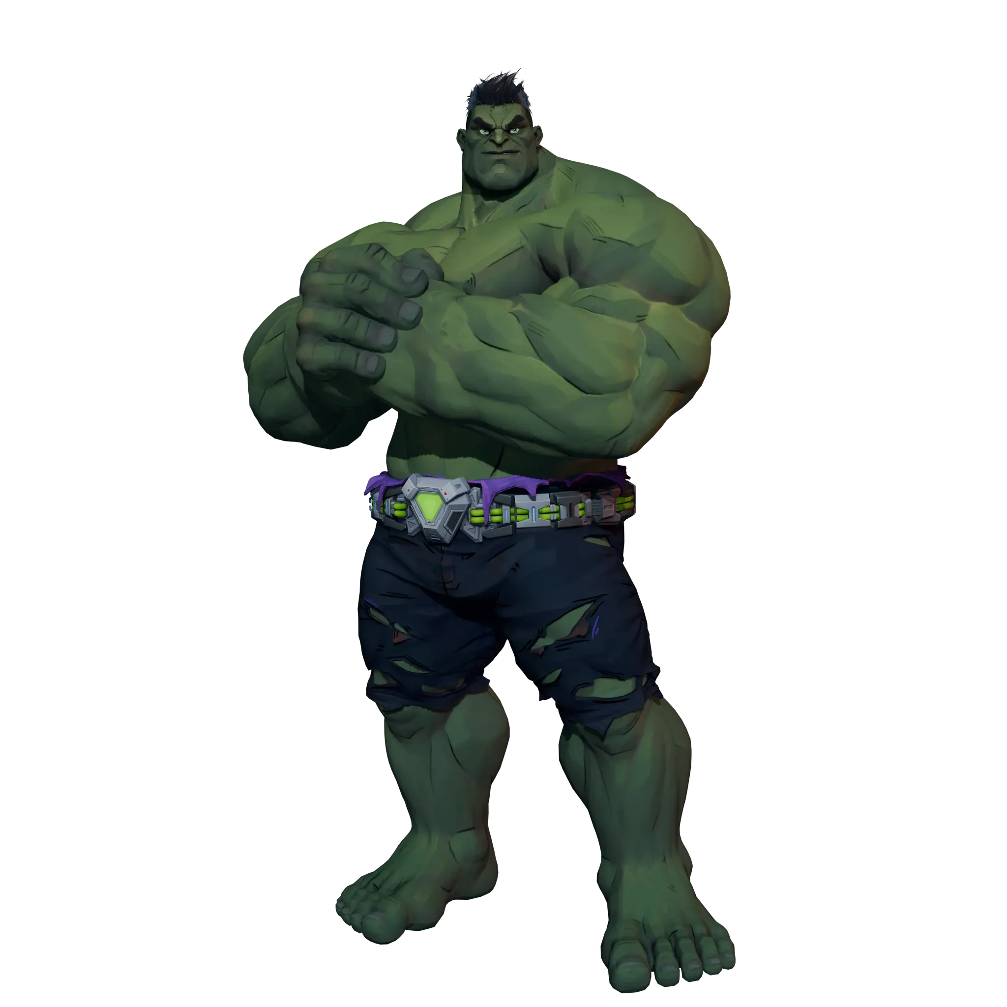
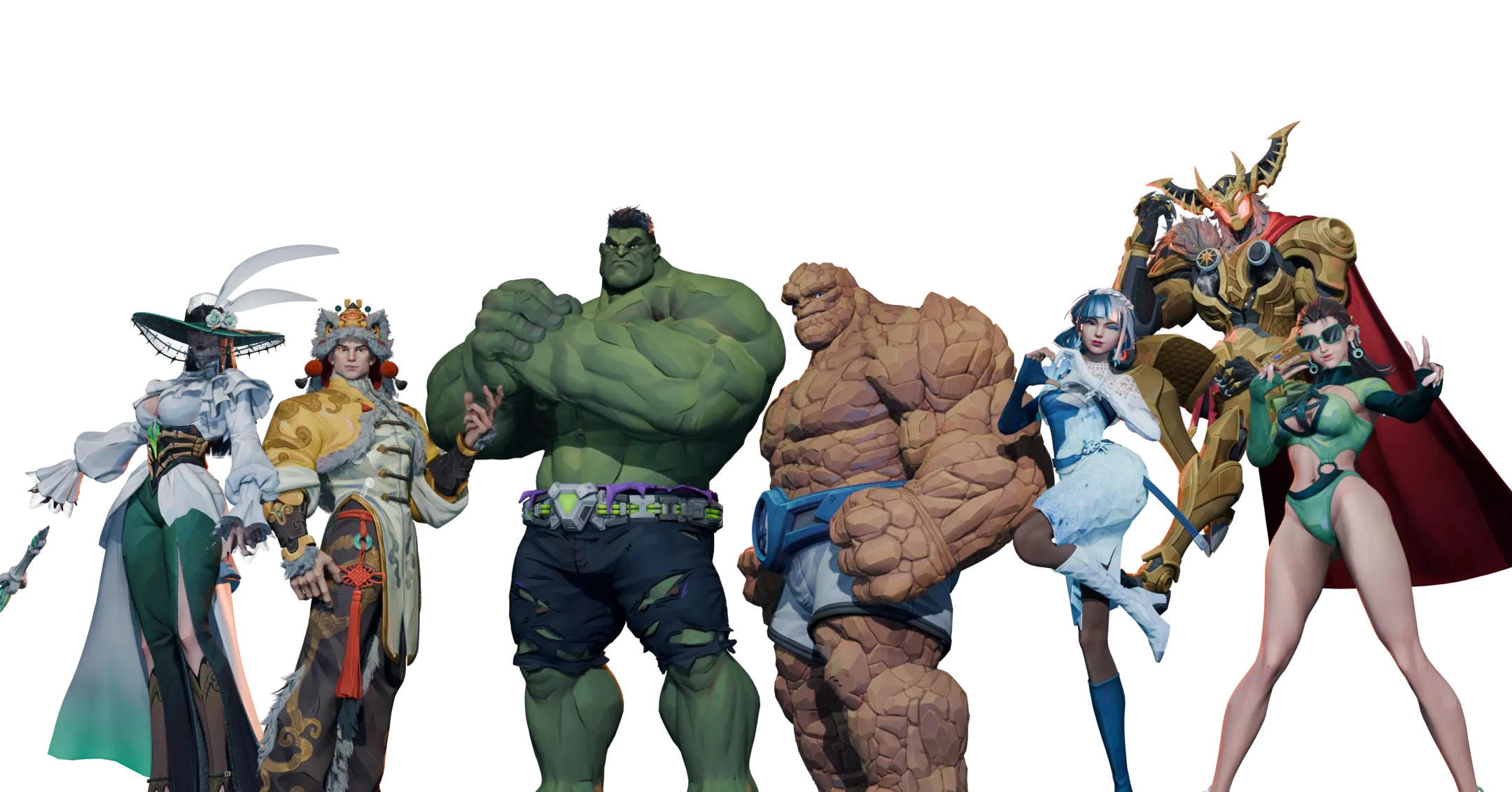
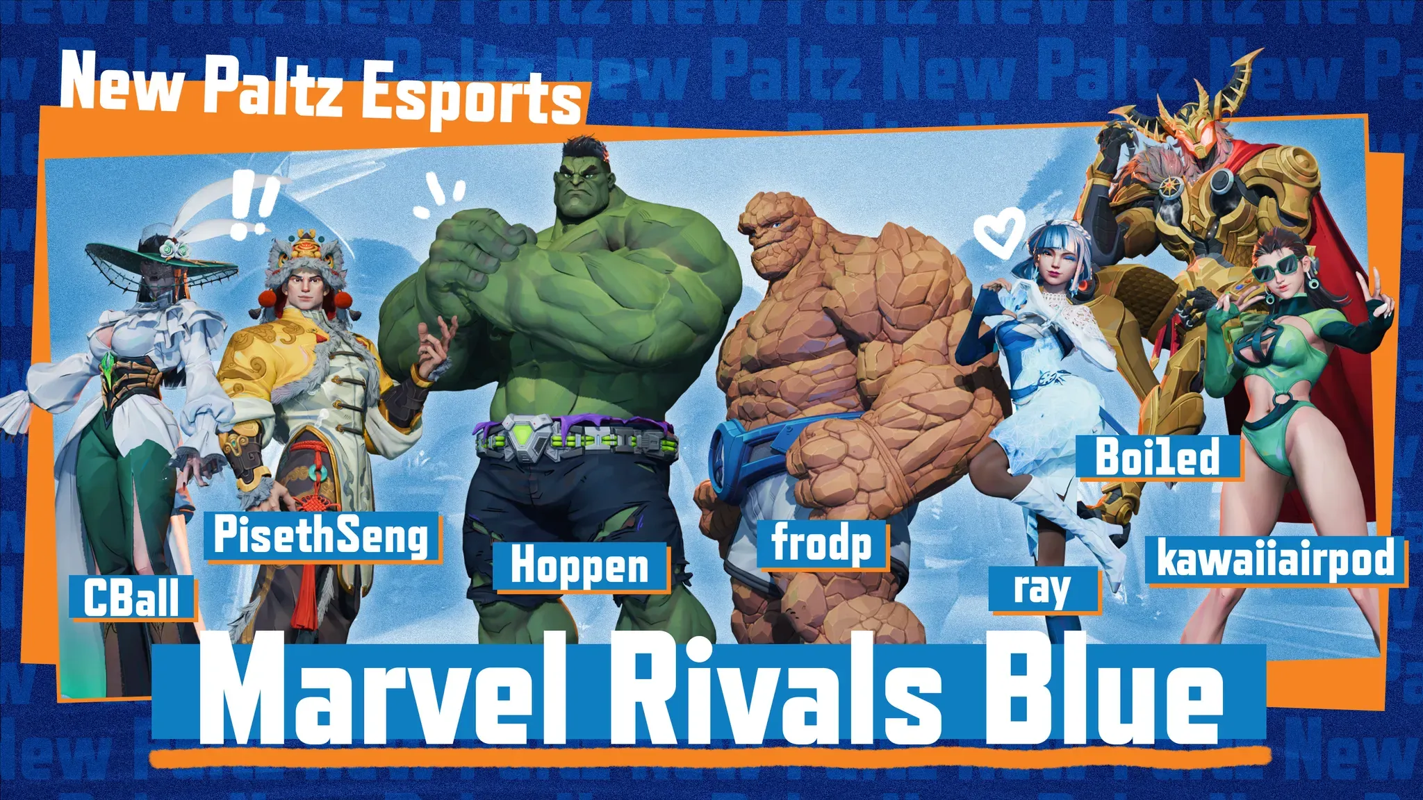
Case Study 3: 3D Compositing
For this final case study I discuss the application of 3D techniques in designing for Esports. I made two graphics using 3D character models and rendering techniques I developed through this case study. The first is a banner for a Twitch stream and the second a team graphic for a Marvel Rivals team. You can see the time lapse for one of these on the website as well!
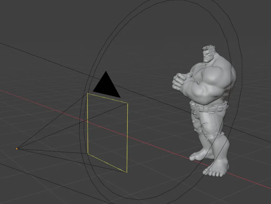
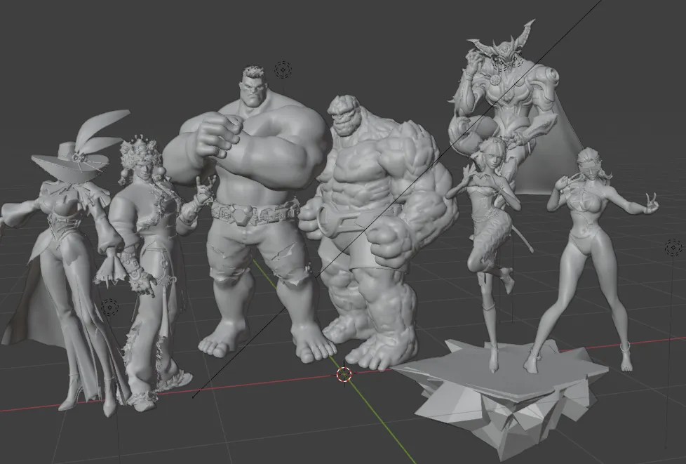
Here is the in-progress iterations for these two projects. You can see the models and posing/lighting I did for them in Blender.
And here are the final outcomes! As mentioned earlier the full processes used to make these are available on the projects website.
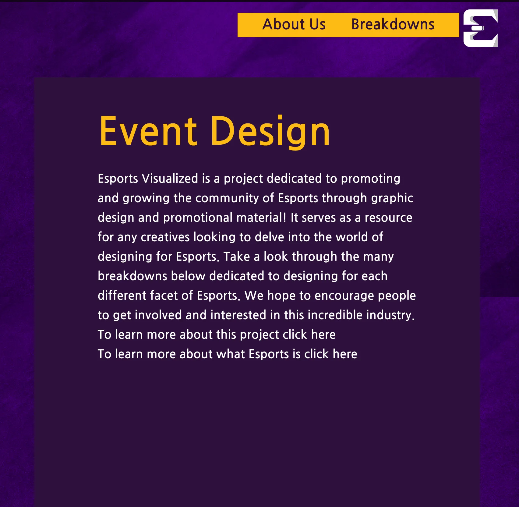
Esports Visualized Website
For my main deliverable for the project I made a website to document all of my case studies. I used Figma to do a rough mapping of the original concept and used HTML/CSS along with Javascript and Astro to fully code the final website!
Here is the in-progress iterations for the website as done in Figma
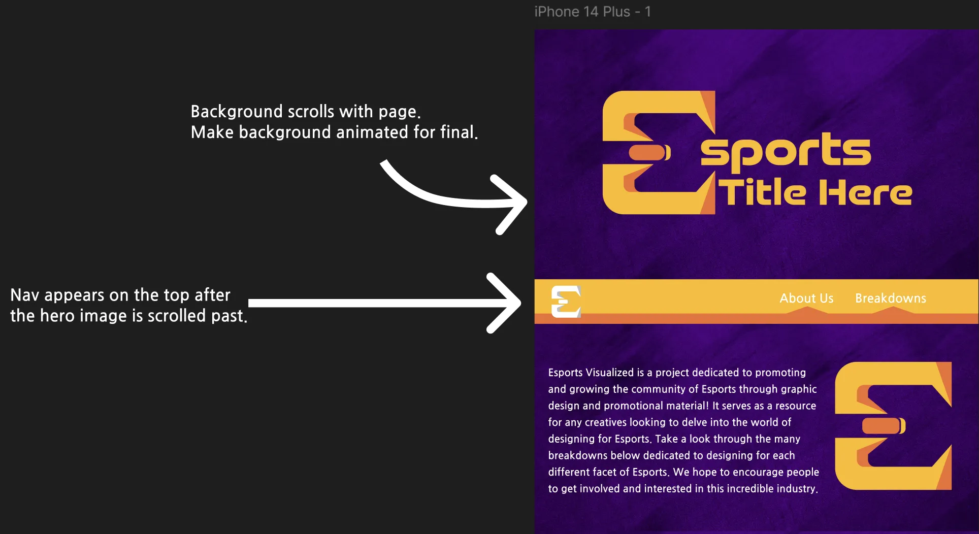
And heres how it turned out in the final outcome! You can visit the site with the link below.
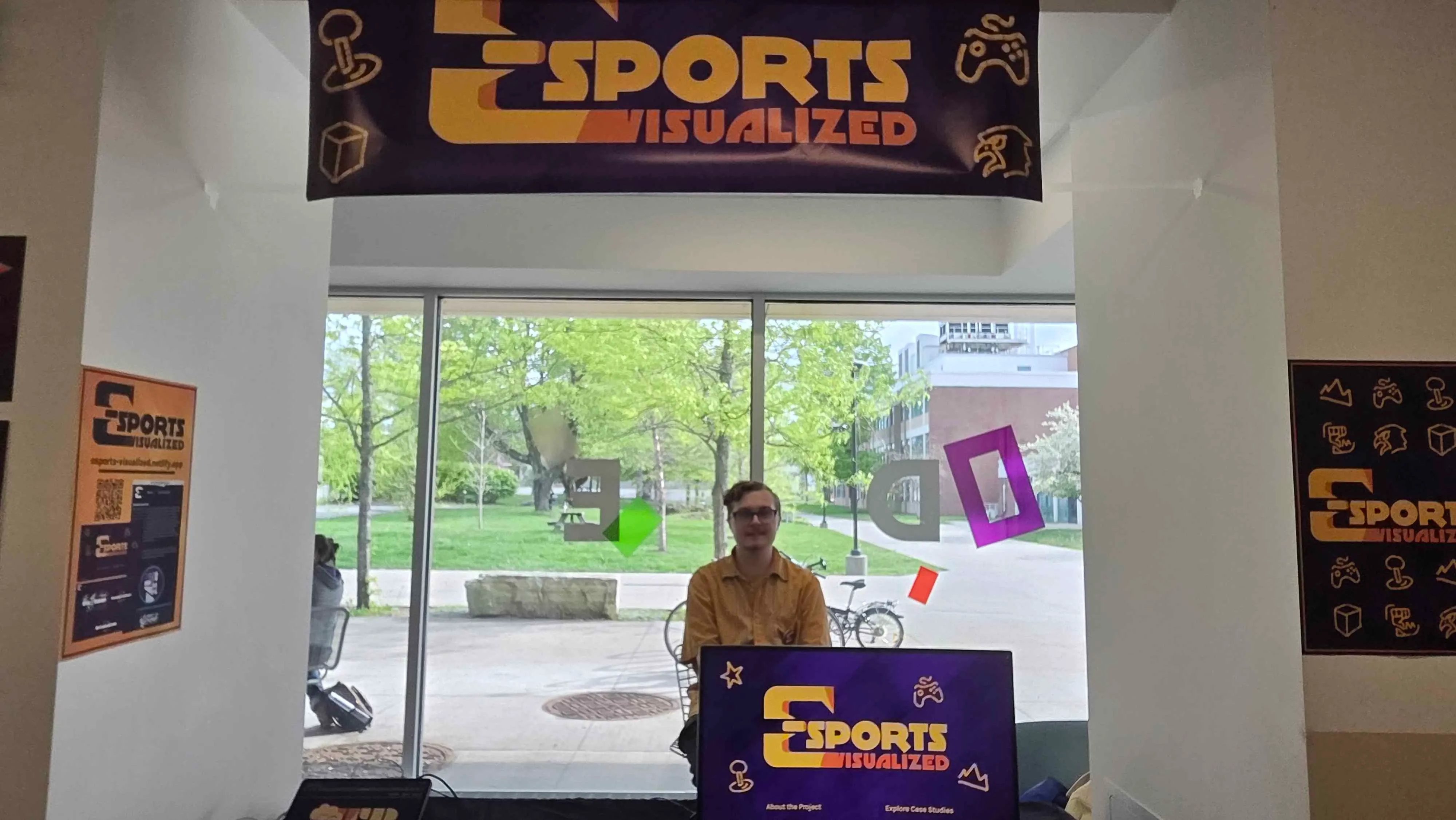
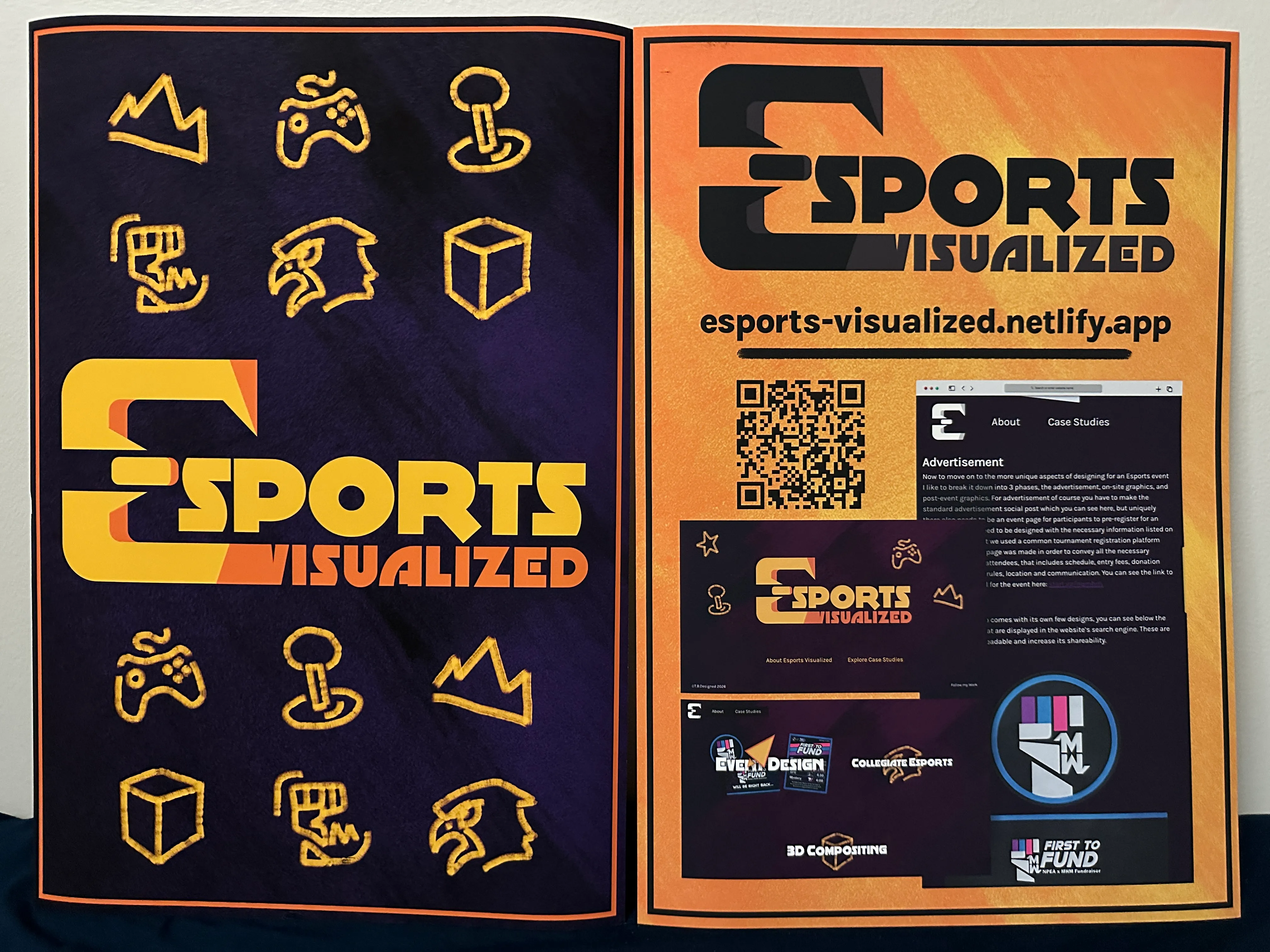
Design Show 26 Showcase
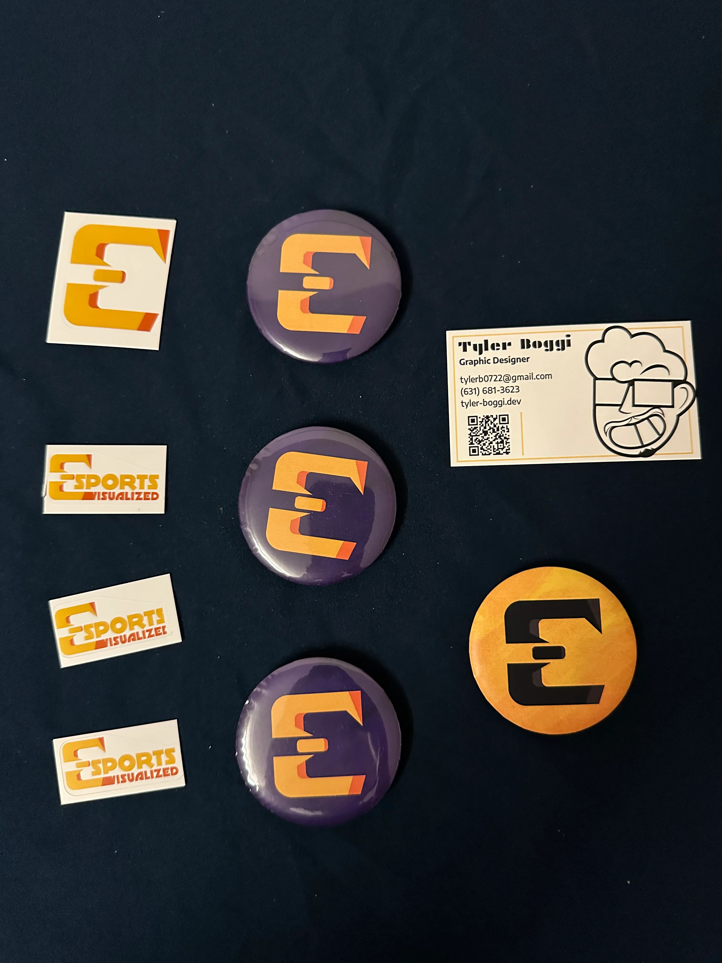
Here is what I showed at the 2026 SUNY New Paltz Design Show! I had two posters, one as a general project poster and another as a QR code to get to the website. I hung my banner over top of me to attract more people to see the project. I also made stickers for both logos of my project and pins to give out to anyone who came up to my table. The main part of my table was using my monitor to showcase the website and having my laptop on my side of the table in order to see where they were looking and help guide them through the site.
Closing Thoughts
This project was a year-long undertaking, involving working with several different clients. I pitched my idea to a wide audience and got several people interested in the idea of designing for Esports. Through this project I gained skills in public speaking, pitching ideas, branding, web design, 3d software, and more! Through this project I was able to reinforce skills that I aim to take with me in my preofessional career and I could not be more proud of myself for sticking through it. This write-up was taken from my Thesis Process Book used as my final summary of all the work I put it. If you would like to see my full documentation of this project then be sure to check out the process book below or visit the project website!