Saldo
For this project I was tasked with making the branding for a luxury car company and several instances of promotional content to showcase the brand style and guidelines
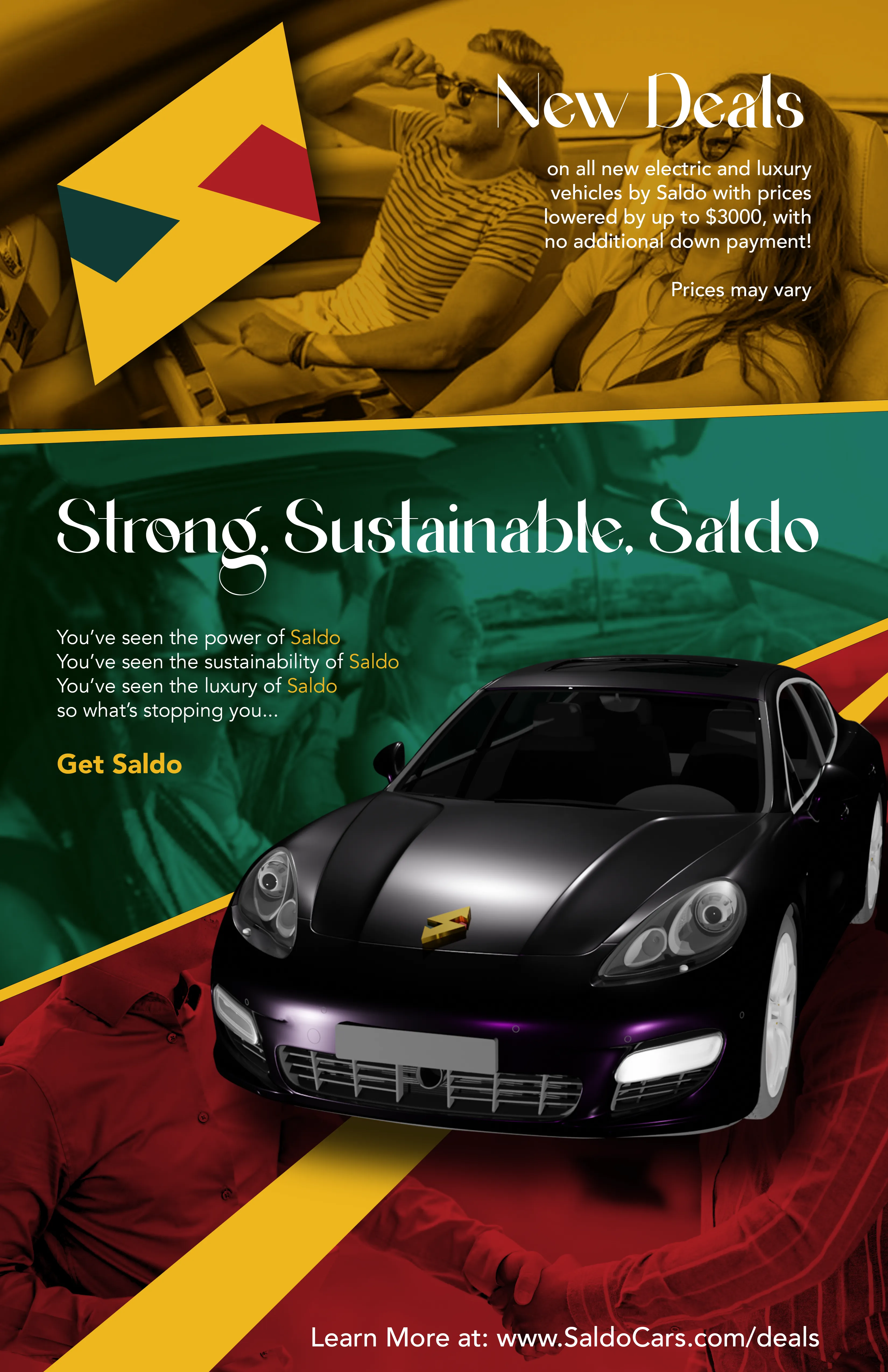
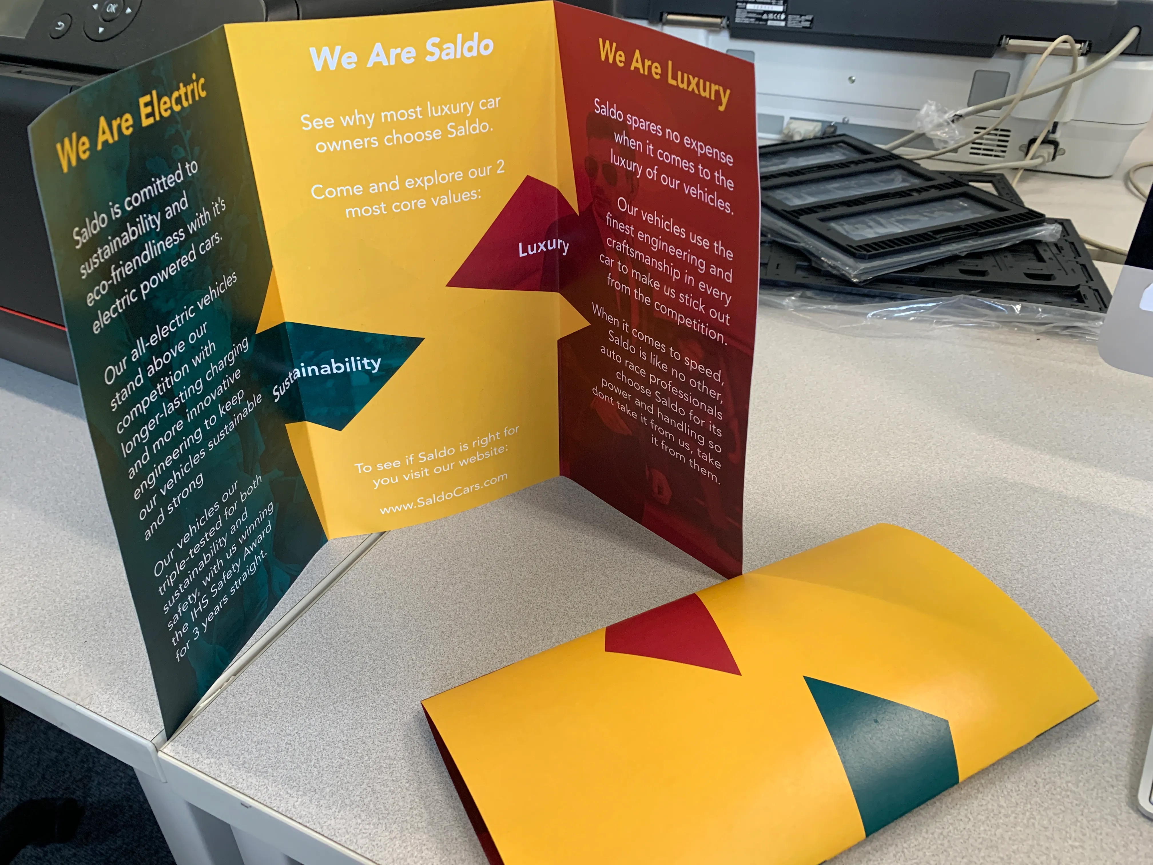
Here you can see my logo branding for the project. I went with the theme of an Italian car company built around balancing strength and luxury. The name Saldo actually comes from the Italian word for Balance and sounds fittingly pretentious for the idea of a luxury car company. The Red was used to show strength and the Green to show luxury with the signature yellow both serving as an in-between of the two ideals and as a way to help it stand out from other car brands which felt like a necessity for how much car companies compete for the very similar advertisment space. As a bonus the yellow S also invokes imagery of the lighting bolt which ties directly into it being an electric car company and promoting strength.
Promotional Material
Here you can see how I applied my branding to some promotional material, for both physical and digital formats. I used blender to create a mock Saldo car model in the advertisement poster and tried to imagine how a more established and confident brand would present themselves to customers.
This was a fun exercise in branding and brand identity that allowed me to truly expand my knowledge on how brands remain cohesive and function. I'd love to put this knowledge into practice to even more brands around the world!