Design Show 2026
What is the Design Show?
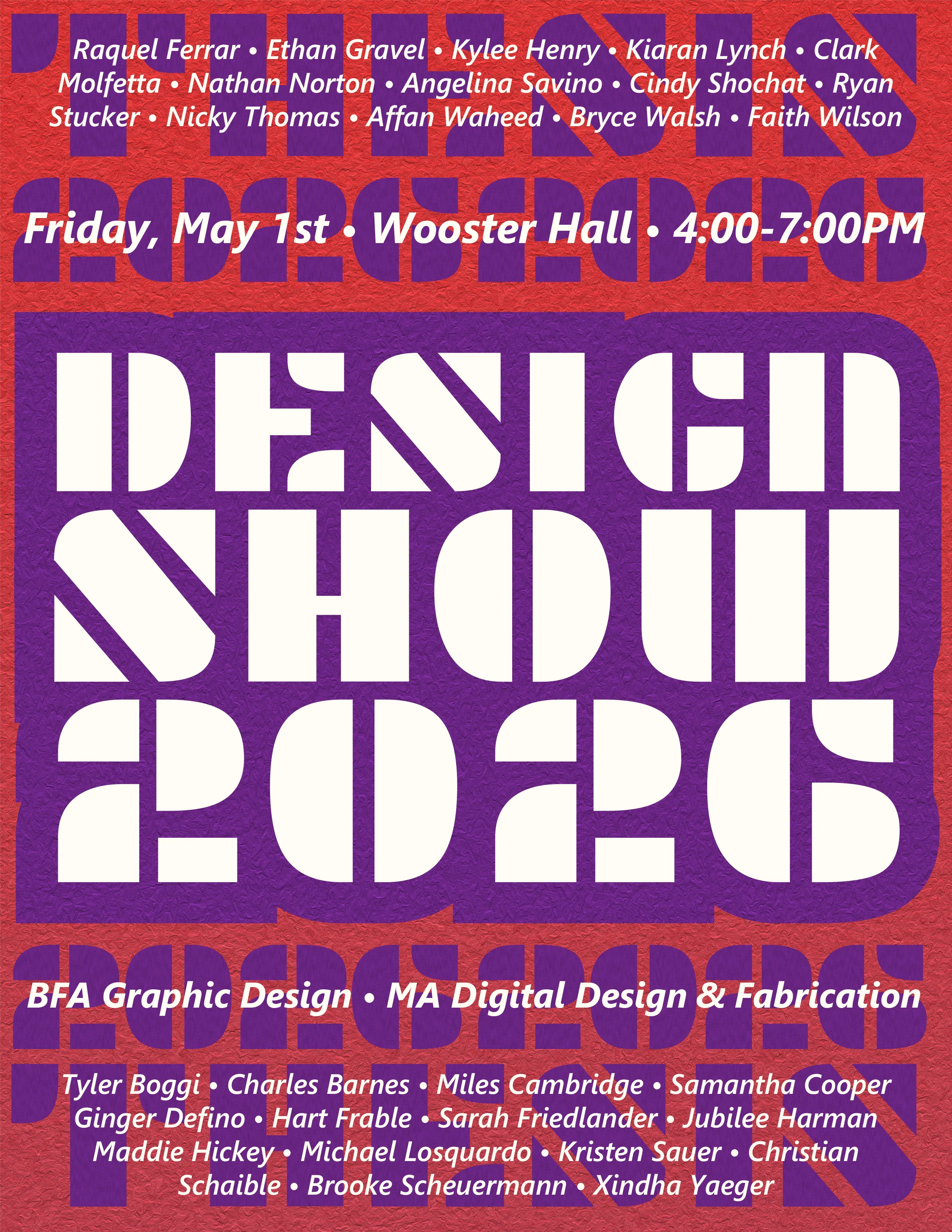
The 2026 Design Show is the once a year Senior Thesis presentation event celebrating the work of graduating students from the MA in Digital Design & Fabrication and the BFA Graphic Design programs in the Department of Design at SUNY New Paltz. I was hired by the Design Department along with four other designers to make up the team that would formulate all of the branding and organization for the show. The show was held on May 1st, 2026 in SUNY New Paltz's Wooster Hall building.
There were two main parts for the process of this project. The first was what we did together as a group, this mostly covered establishing the initial brand identity and visual style for the show that we would then all use in our own sections. There was some other small aspects as well like the Save the Date promo and event setup that we all collectively helped with. The second part was our individual sections, with so many aspects to this project we needed to divide our roles among the group in order to cover everything needed for the show in one semester. For my section I handled the design, development, deployment and advertising of the show's website. This part of the project was done entirely seperate and on my own with advice given from the rest of the group as it was produced.
Part One: Branding
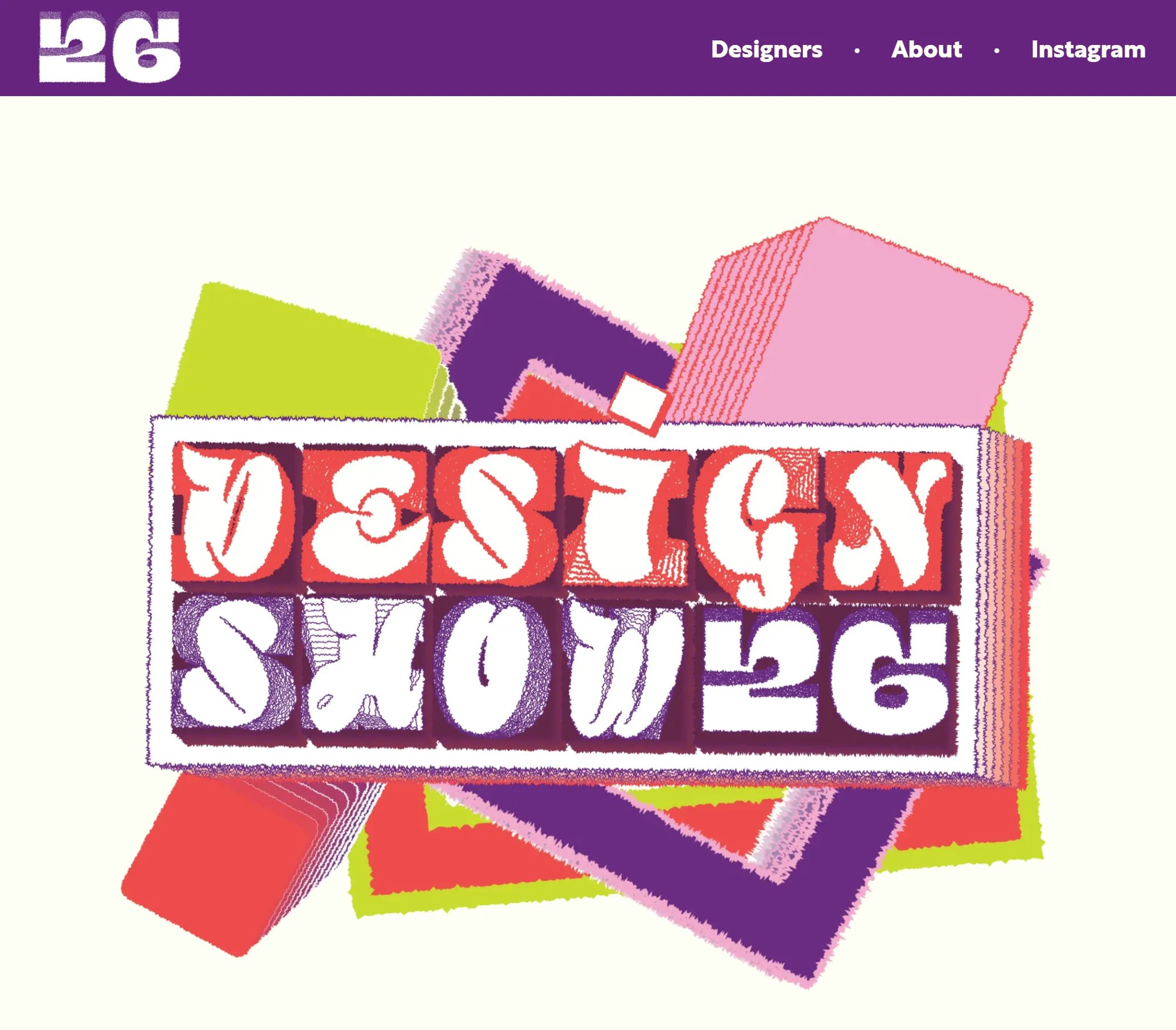
For the first part of the project it was about working with the team in order to create the branding for the show. We started by reviewing the past shows and defining what we liked from them and what we thought needed to change. As a group we wanted to stand out from other years and in order to do that we decided that we would avoid black and white when designing for the show along with coming up with some unique themes to follow. For our themes we followed two main ideas we wanted to base the show around. First was the structural idea of "stacking", this was a concept we all liked as it worked as a good start to how to design for the show while also being able to be reframed as a narrative. An example is the phrase "stack of talent" which was used in our branding to highlight how far the students have come. Second was the idea of "persistence", this was the more abstract, identity-based theme we went with. With the current state of the world at the time we wanted to highlight the struggles that a lot of us were going through and how we were able to persist and create despite that. This showed up in aspects of the design like the rugged textures and constant movement.
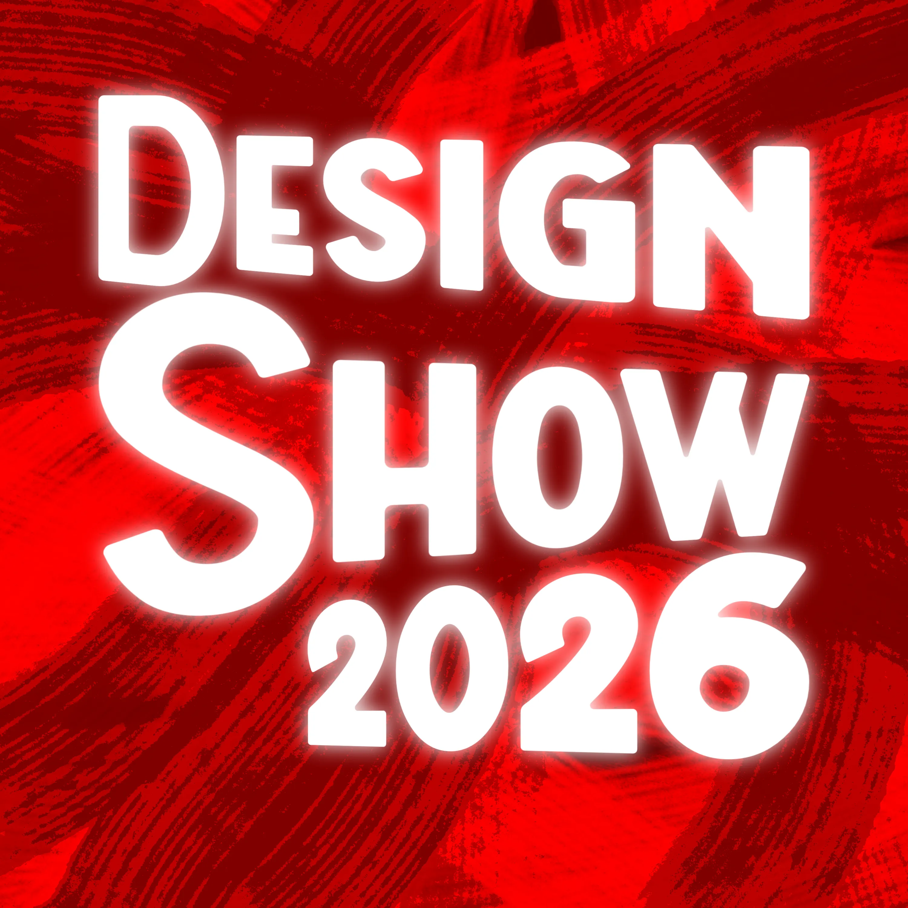
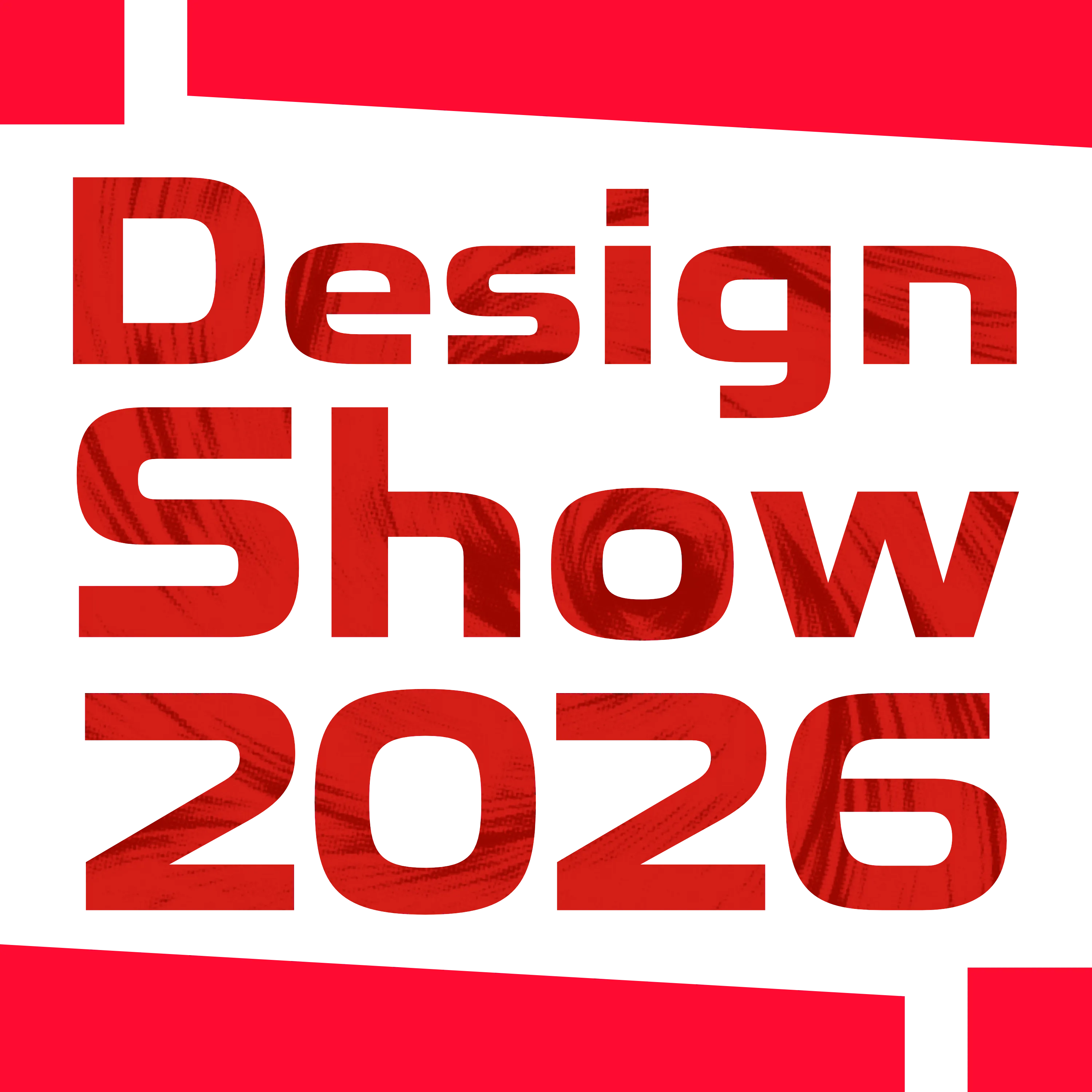
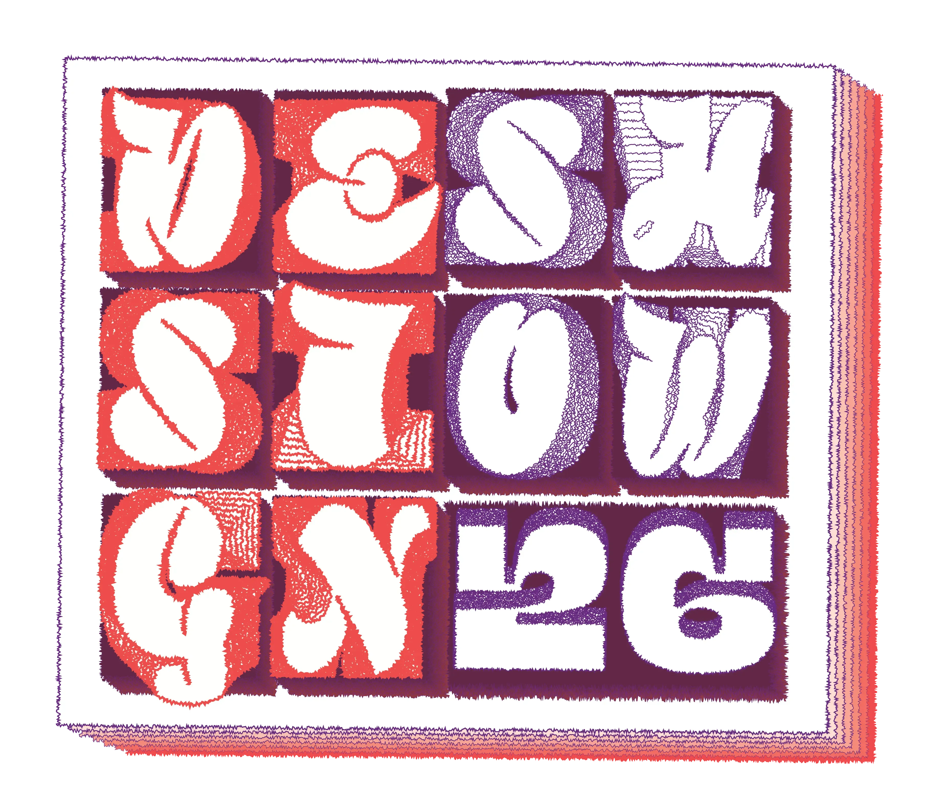
To highlight now the actual iteration process we went through many different forms and variations among the five of us but I can highlight here my contributions to the final design theme. During our first round of iteration I highlighted that it could be good to have a theme to base the design style around to make things more cohesive. During our second round of iterations I mentioned using a grid layout and breaking that grid occasionally which was used more so in the promotional material. During our first round of drafting brand directions I came up with our signature red color as a way to symbolize the chaos and our persistence through it. It also served to differentiate us from past years as most shows went with black and cool colors or with the full rainbow. You can see these initial brand directions I made below.
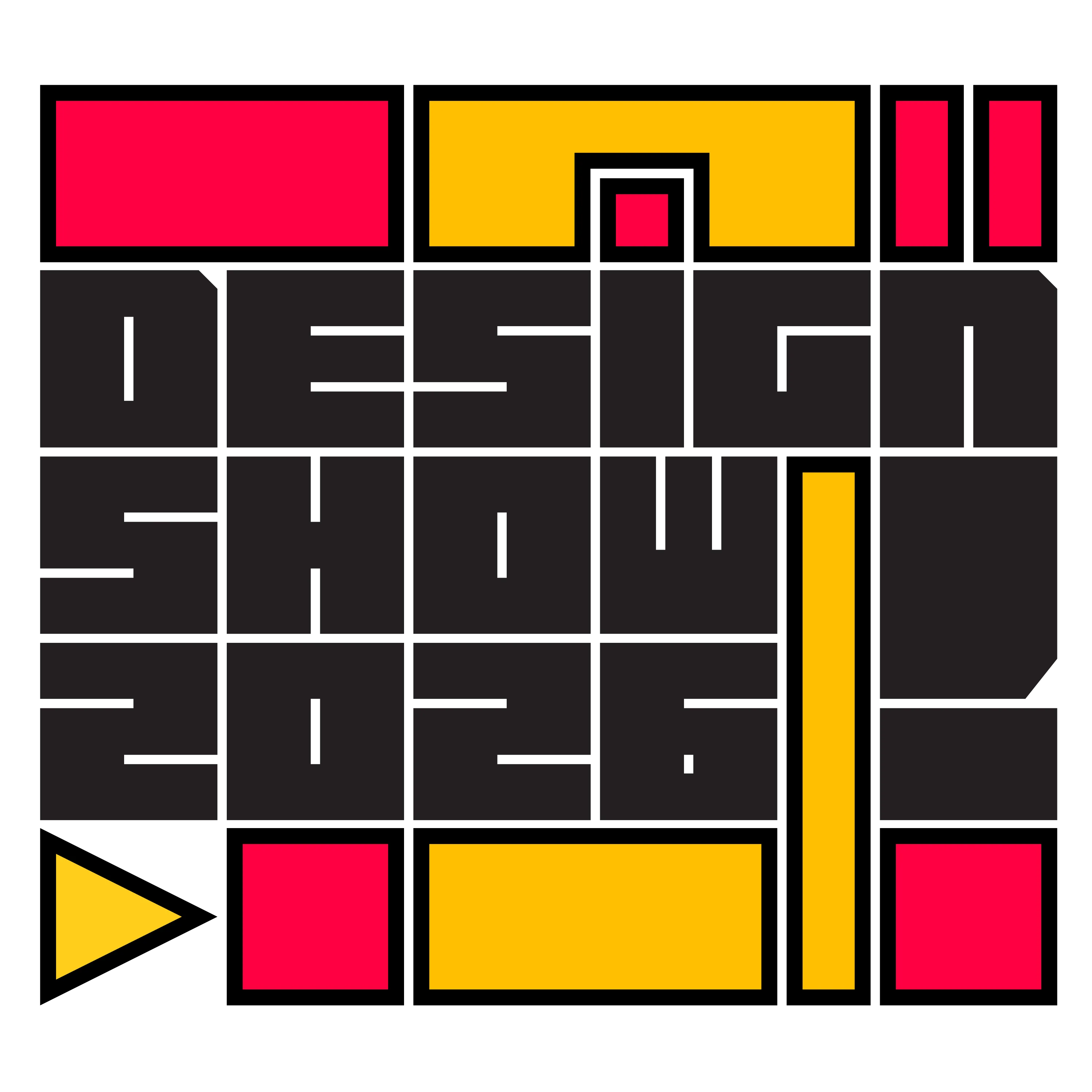
From there we decided on a few color palettes that we would each make a brand example of in order to decide which color palette and design looked best. My contribution to the palettes was partially to the blue/yellow one and mainly to the red/purple palette that we would end up using for the show. You can see below the concepts that I made for these two colors palettes.
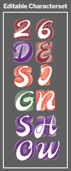
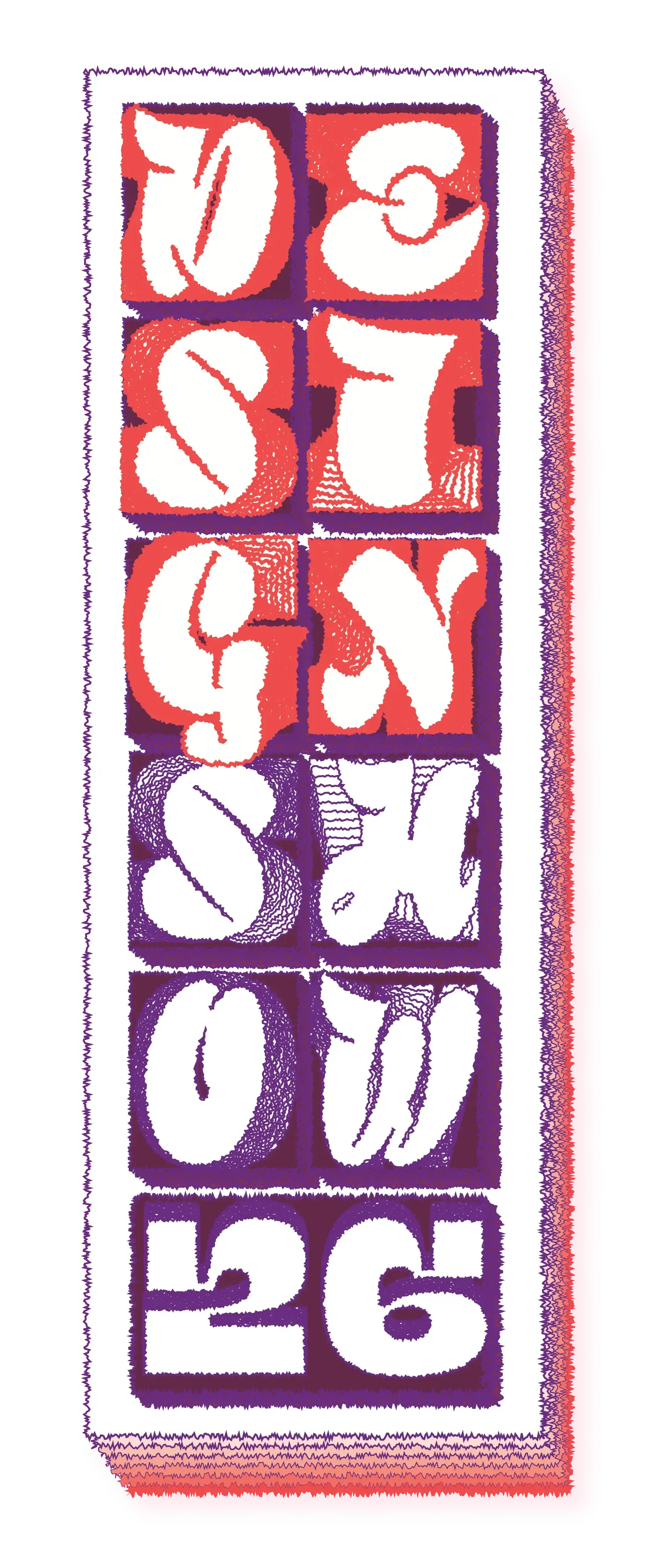
After this phase we brought our designs to faculty and the senior thesis students where we got valuable feedback. We got reaffirmed in the color palette for the project working but decided to go with one of our other ideas on layered typography and blending. From there we each did our own iterations on the idea. What I did during this phase was fix an issue our team was having in having the letters be un-editable and created a fully editable method for the effect that we wanted. This along with expanding the concept brought us here.
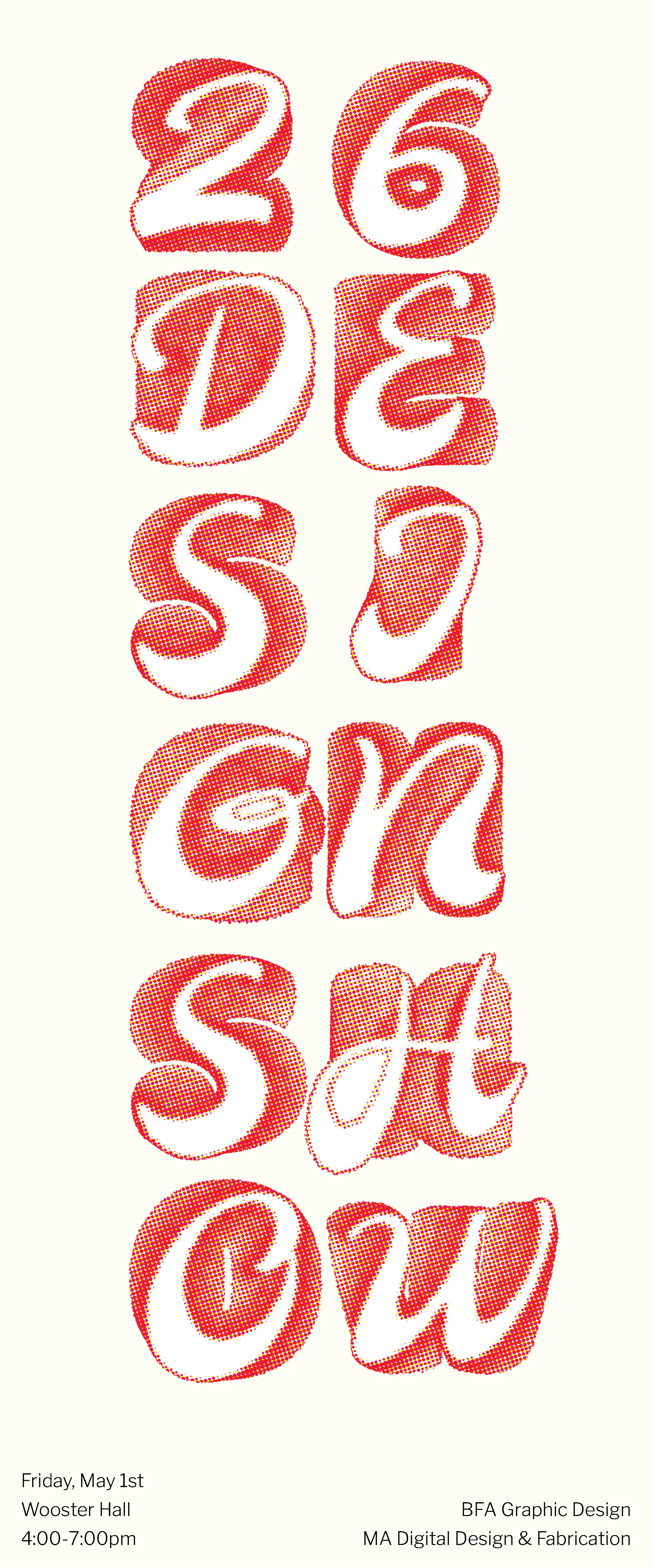
Through one last long meeting after this we were finally able to come up with our final brand for the show! You can see our logos below, these were stacked in three different ways both to follow our theme and allow up to be more responsive with the logo. The jagged edges and overlapping fonts kept our theme of persistence and it all followed our red/purple color palette.
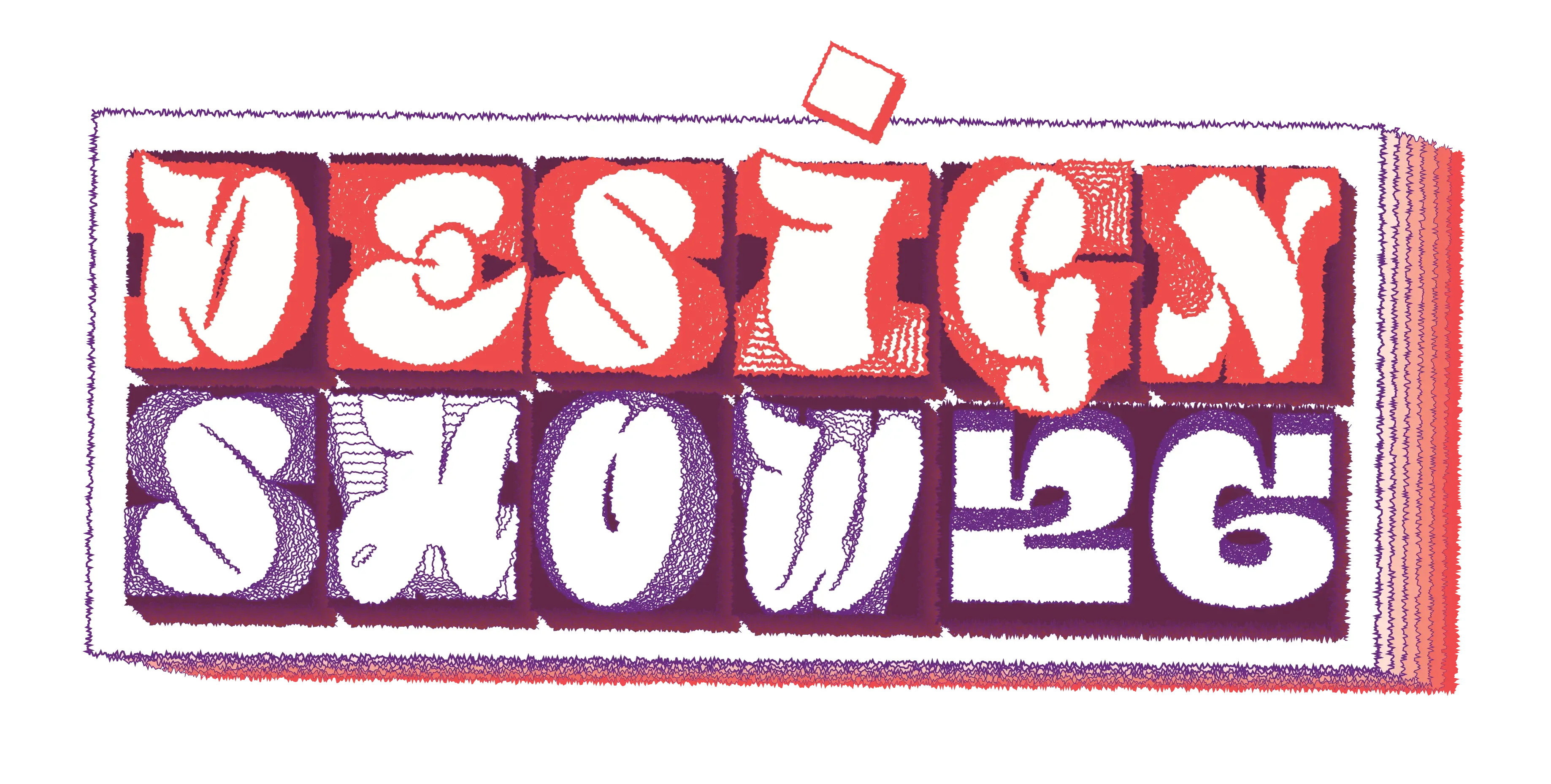
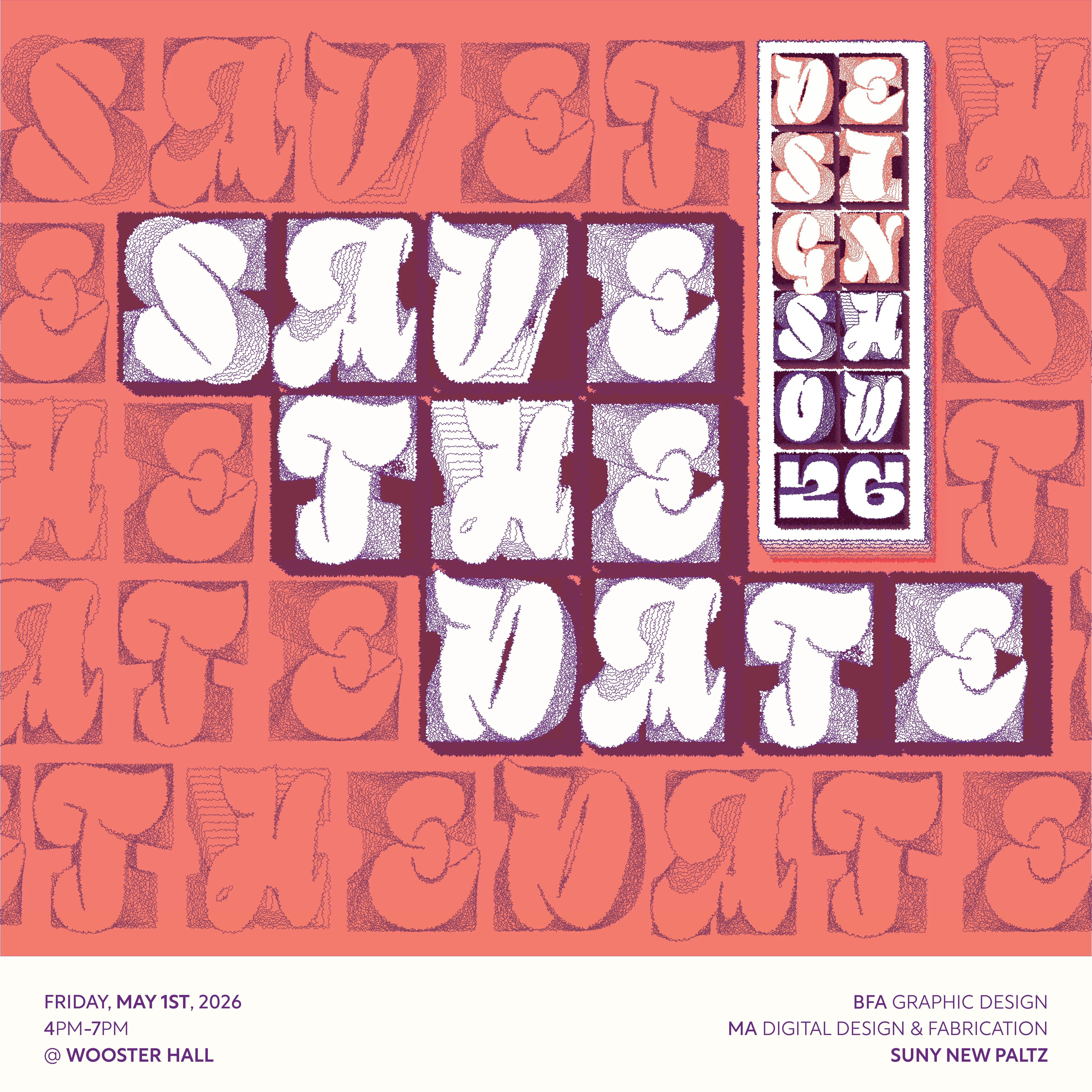
Initially our logo was a bit more faded but part way through we decided to brighten it with our neon red color. This can more prominently be seen in the "Save the Date" promo that we did
Part Two: Website
With the branding done together we split to work on our assigned roles, for me this was creating the design show website! I started by referencing past years and their websites, from here I got a good idea of a layout that would both incorperate what worked from bast years while also standing out from them as we intended. I made a figma prototype to reflect this initial layout idea which you can see below.
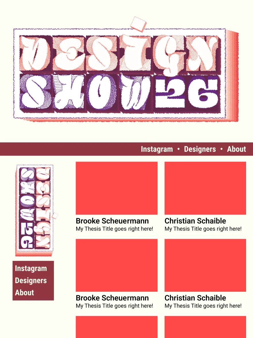
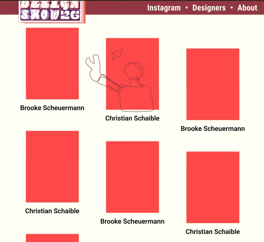
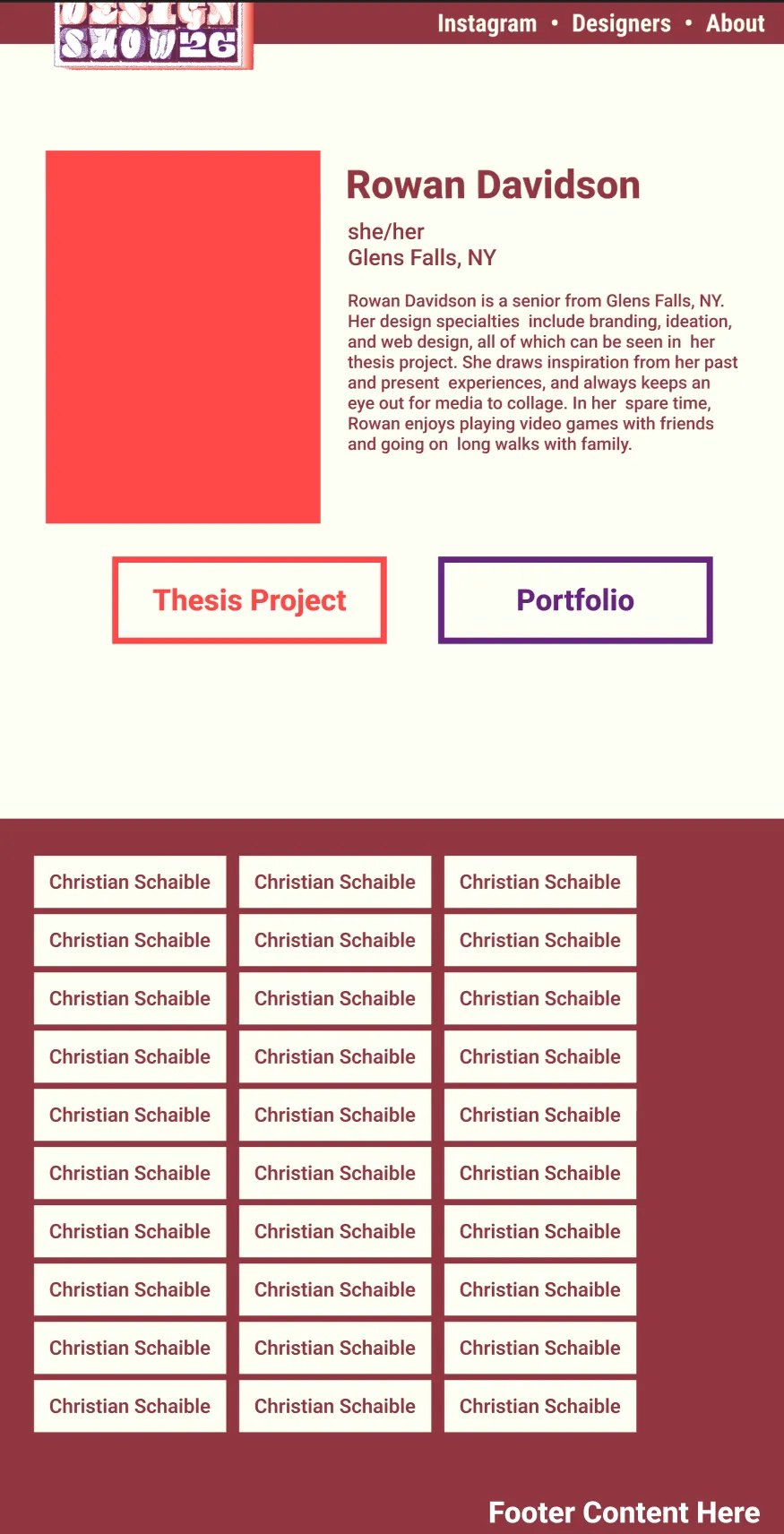
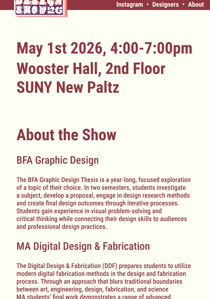
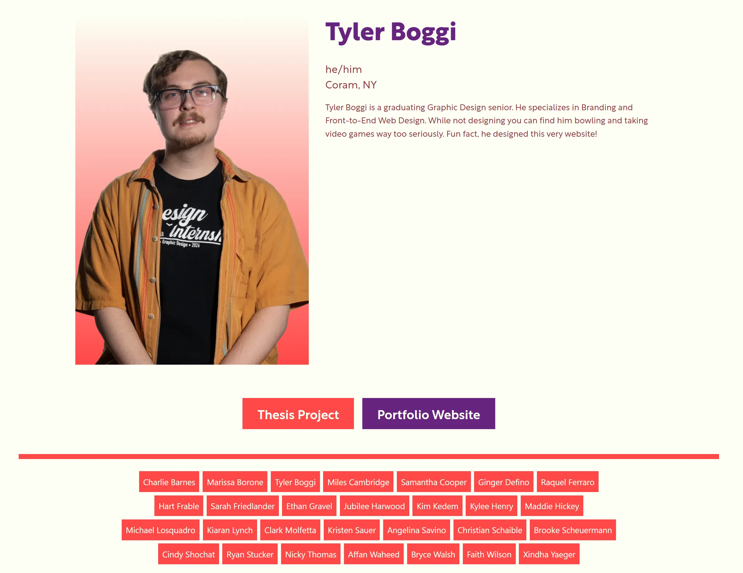
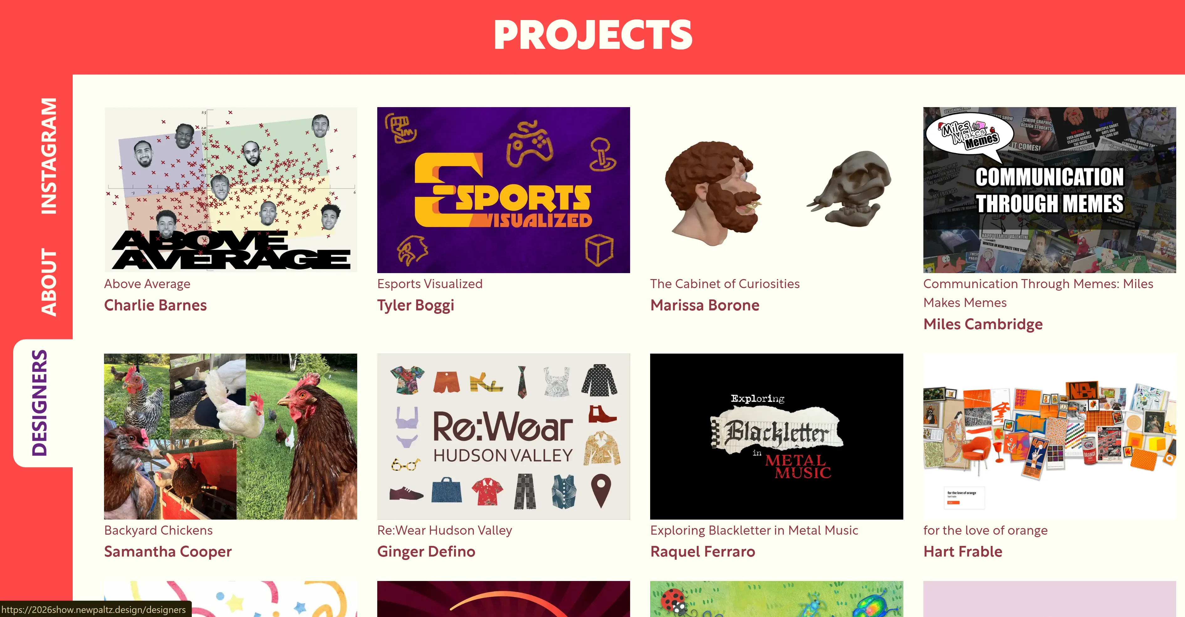
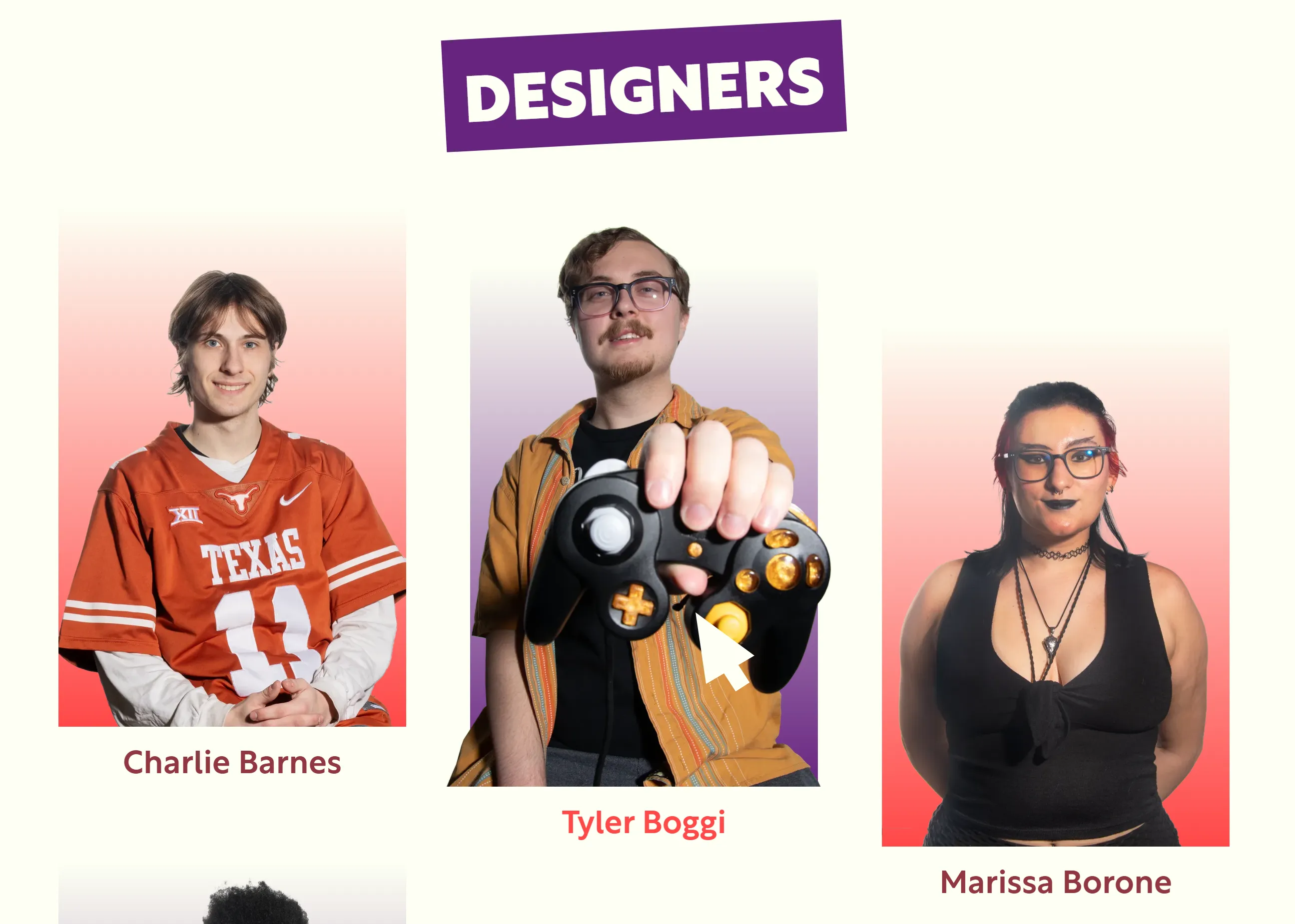
From here I used HTML/CSS with Astro and JavaScript in order to beging developing and designing the final website. I added a few things to the layout like a side nav bar on wider screens for the homepage. I also added an interactive map to the about page to allow people to know where they were going. I added some additional accent colos to the header and text styles with rotation and box outlines to the text headers, all of which were inspired by slight branding changes we made later on in the process for other aspects that the team worked on. One thing that I made that I am especially proud of was the interactive and responsive elements. I have several hover style that make the site come to life, especially the one used in the designers page to highlight the additional silly photos we took of each student and the responsive header using the several variations of the show logo. You can see these highlighted below in the screenshots of the website and if you would like to visit the site you can click the link below or go to 2026show.newpaltz.design